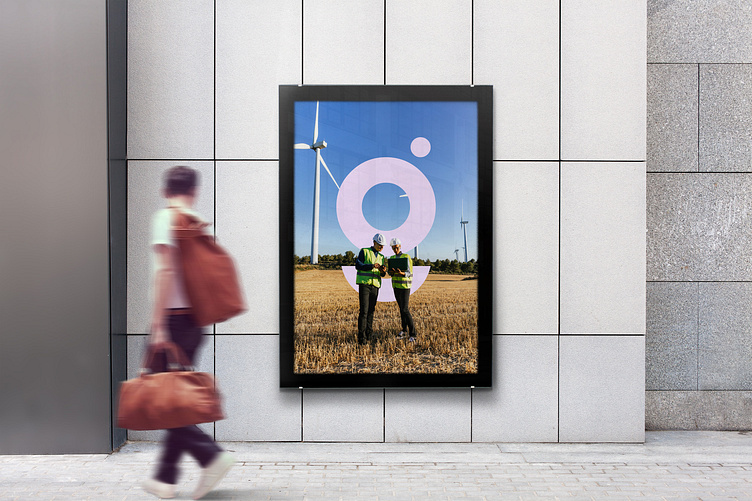
MORPHOSE x Le Guide Des Energies Renouvelables - Brand Identity
LGDER is a key player in the field of renewable energies and energy transition in France and Europe.
Le Guide des Energies Renouvelables becomes LGDER. The first letters of the service are used to get straight to the point. The logo adopts a round shape, symbolizing harmony and the Earth.
The tail of the G becomes emblematic, graphically symbolizing the Earth.
More by Morphose.io View profile
Like


