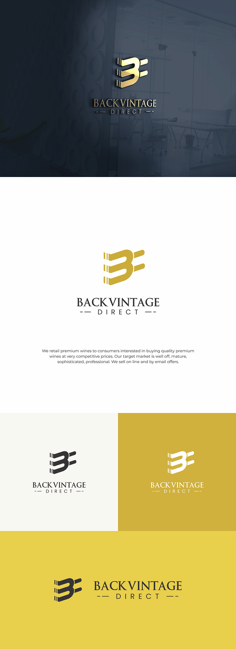
Logo for Back Vintage: Elegant Wine Retail Branding
I am thrilled to unveil the new logo design for Back Vintage, a premier retail company specializing in fine wines. This sophisticated logo is crafted from the initial 'B,' creatively shaped to resemble a wine bottle, capturing the essence of the brand in a unique and memorable way.
The primary color is gold, chosen for its elegance and association with luxury and quality. This color not only enhances the visual appeal but also reflects the premium nature of the wines offered by Back Vintage. The design aims to convey a sense of refinement, tradition, and excellence, aligning perfectly with the company's dedication to providing top-notch wine selections.
Logo Specifications:
Type: Retail Wine Company Logo
Primary Color: Gold
Key Elements: Wine Bottle Shaped 'B'
Meaning: Elegance, Luxury, Quality, Tradition
I welcome feedback and insights from the Dribbble community. Thank you for viewing my project!
