Invoice Page Design Case Study: Popeyes Louisiana Kitchen
Popeyes is a well-known fast-food chain around the world. I recently worked on their UK website’s invoice page. The goal of this project was to create an intuitive, user-friendly interface that improves the overall customer experience during the checkout process.
Design Objectives
The primary aims for this project were:
Usability: Design an interface that’s easy to navigate and understand.
Visual Appeal: Create a visually appealing design that goes well with Popeyess' branding.
Increase Conversion Rates: Design elements that facilitate smooth user flow and reduce friction points in the checkout process.
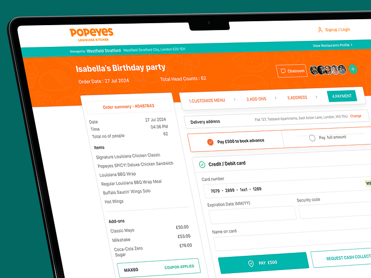
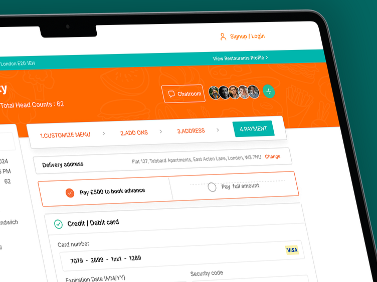
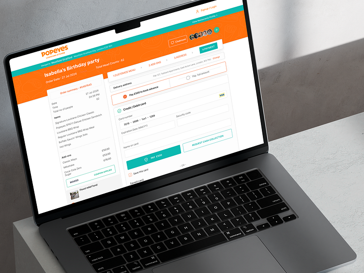
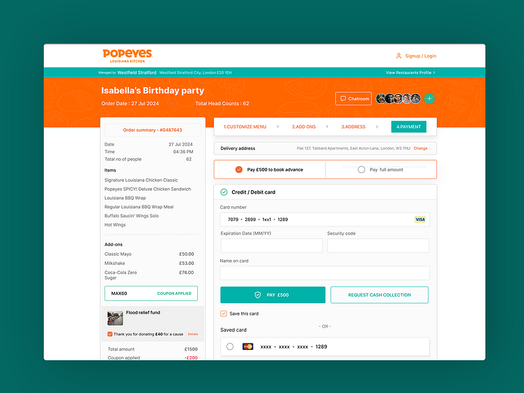
Design Features
Color Scheme: Popeyess' signature orange and green colors are used to draw attention and guide users.
Clear Hierarchy: Headings, subheadings, and section dividers create a clear progression through the process.
Readability: clean font, ample spacing, and highlighted key information enhance readability.
Call to Action (CTAs): Prominent CTAs guide users through the checkout process.
Visual Feedback: Messages and acknowledgments keep users informed of their actions.
User-Friendly Forms: A clean layout and clearly labeled fields reduce errors.
Progress Indicators: The step-by-step progress bar shows users where they are in the process.