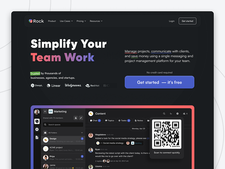
B2B SaaS Website Redesign [Ep. 1]
📢 I’m excited to launch a new series where I explore potential redesigns for various websites, showcasing improvements that can increase conversion rate, and enhance user experience and visual appeal.
Today, I’m sharing a redesign exploration for Rock website!
⬜ The original website offers a clean and straightforward interface, but there's room to increase conversion rates and create a more engaging and visually striking design.
⬛ After Redesign: Introducing a proposed dark theme! It’s more than just a color change. Here are some of the key enhancements I envisioned:
1. Bold, Vibrant Design:
↳ The dark theme makes content stand out, grabbing user attention effectively.
2. Improved Readability:
↳ Enhanced contrast improves readability and reduces eye strain.
3. Clear CTA:
↳ Prominent and distinct CTAs lead users to sign up or start a free trial, driving conversions with risk-free messaging.
4. User Testimonials and Social Proof:
↳ Showcasing testimonials and trusted brands boosts credibility, and encourages new users to try the platform.
With these improvements, the new design is poised to significantly boost user engagement and satisfaction.
By enhancing the user experience, the potential for increasing conversion rates is high, which can ultimately double Rock's MRR.
Share your thoughts on this redesign exploration!
Let's Talk 👋
Visit our website:
Services We Provide :
Website design - Webflow Development - Web app Design
