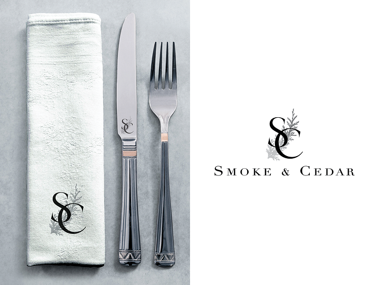
Smoke & Cedar branding / final direction
The client chose this direction, with a black and white color scheme and a rather cattle-brand looking mark to accompany the Didot typeface wordmark. Here you can see it mocked up on napkin and knife.
More by Luke Dubois View profile
Like
