[Case study] iSharing — Real-time location tracker
In 2021, I had the opportunity to work with iSharing, a US-based startup renowned for its social mapping platform designed for close friends and family. The platform, boasting over 10 million users, aims to enhance connectivity and location sharing among its user base. As part of the Z1 team, my role as a Product Designer, alongside a dedicated Product Manager, was pivotal in steering the project's direction. The development process was meticulously managed by iSharing, ensuring seamless integration of our design efforts.
We employed a structured approach to collaboration, setting weekly milestones that covered a comprehensive range of activities from research and definition to ideation, prototyping, and final delivery. Despite the project running concurrently with other commitments, we strategically allocated about 30% of our time to this initiative, ensuring that our contributions were both focused and impactful. This methodical workflow allowed us to maintain a high standard of output without compromising on the quality of our other projects.
The Challenge
The client approached Z1 to elevate their product: firstly, they needed to refresh the outdated UI plagued with usability bugs and issues. Secondly, they wanted to introduce a new feature allowing users to create different groups of friends. Given the limited resources, it was crucial to ideate, test, and iterate quickly to achieve the desired outcomes within an optimal timeframe.
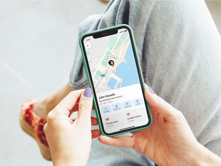
Old iSharing interface, which I have completely redesigned to enhance user experience and update the visual aesthetics
The process
When the collaboration began, the client provided us with key documentation. This included user pain points and specifications for the new features we needed to design. We conducted a design audit to identify visible usability issues and visual flaws. With over 10 million users, we also leveraged user feedback from both the App Store and Play Store.
In parallel, we conducted a benchmarking analysis, studying direct and indirect competitors (Zenly, Life 360, Findme, etc.). We analyzed their interfaces and key features, such as the ability to create groups. These insights were organized, classified, and analyzed to provide us with key inputs for the definition phase.
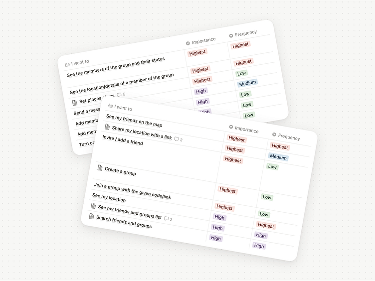
Before starting with sketches, we implemented a ranking system to define the importance and frequency of use for each feature, which was key to prioritizing them.
Once the features were prioritized, we created low-fidelity wireframes for the screens that needed a redesign from scratch. We made several quick hand sketches, selecting the most convincing options. We then proceeded to create high-fidelity wireframes of the selected options and conducted various usability tests. For each decision, we considered three aspects: insights from usability tests, technical limitations, and alignment with existing app patterns to avoid radical changes that could be hard for users to adapt to.
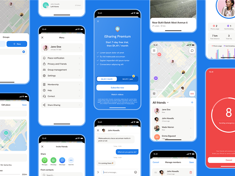
I tackled several key user experience challenges and introduced significant improvements. The primary goals were to refresh the outdated UI and add new features, including a 'group mode' and an enhanced location sharing option.
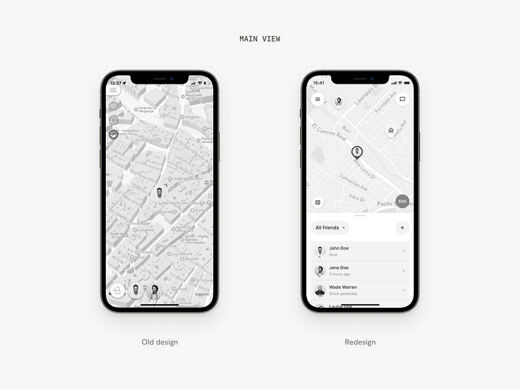
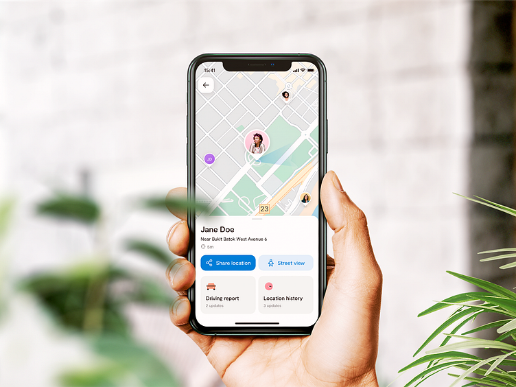
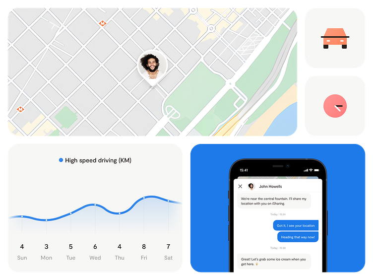
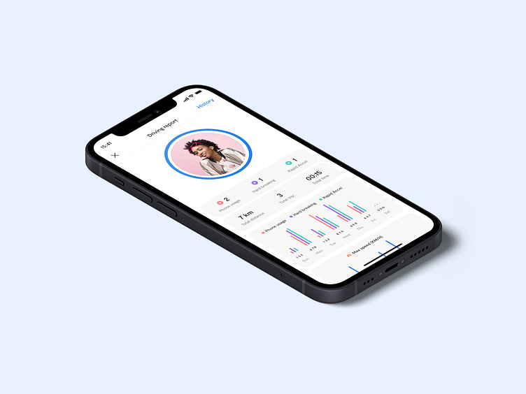
I focused on enabling users to create and manage multiple groups, invite friends via code or link, and share settings like location alerts and privacy levels. Issues with small, indistinguishable icons and difficulties in managing large friend lists were resolved by redesigning the interface with larger, clearer icons and implementing 'group mode.' The overall interface was enhanced to prioritize actions like seeing friends on the map and sharing locations.
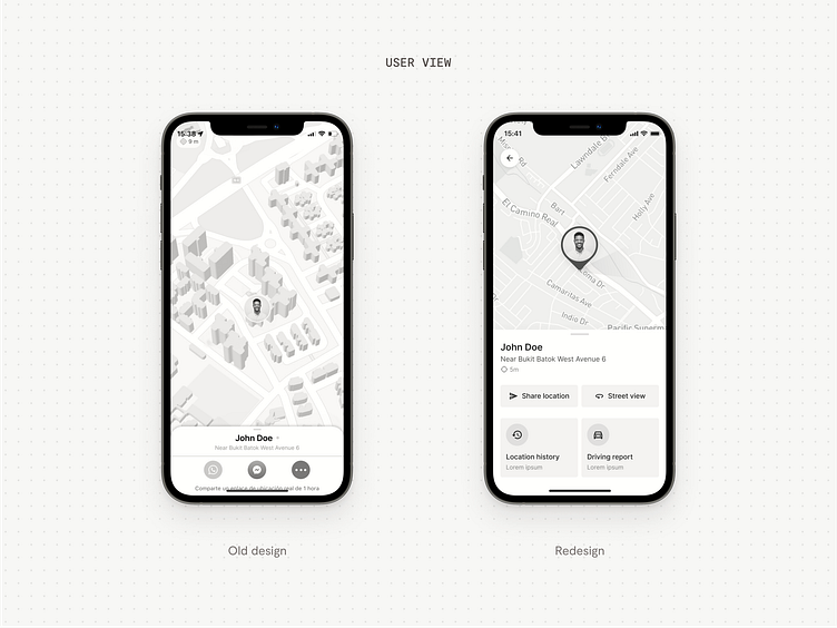
For the location-sharing feature, feedback indicated the sharing buttons were not fully visible and the icons unclear. I made the sharing option more prominent and added the ability to set an expiration time for the link, providing users with more control over their privacy.
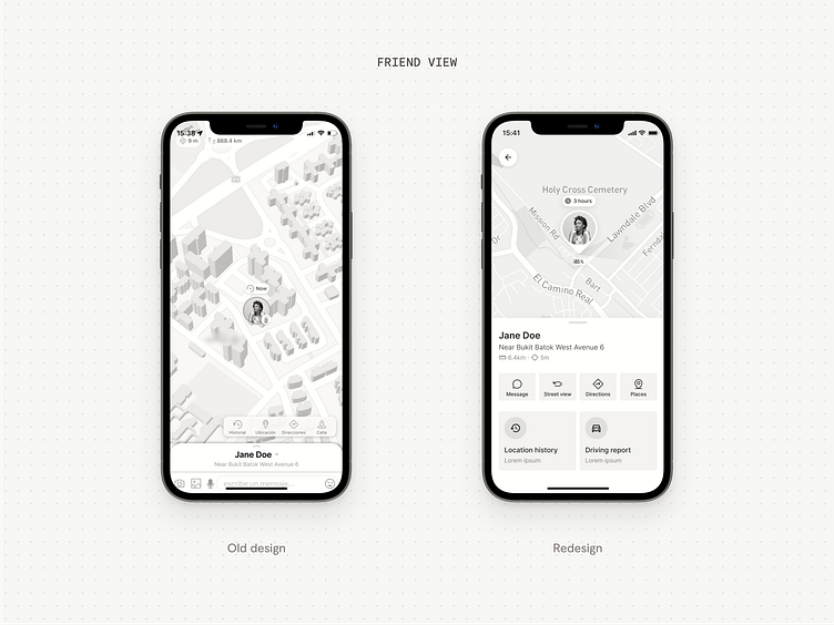
Additionally, the friend view was improved by repositioning the message field and actions for better accessibility, adding a close button, and redesigning action icons to be larger and clearer. The option to set an expiration time for shared links and streamline user management was also introduced.
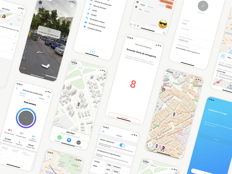
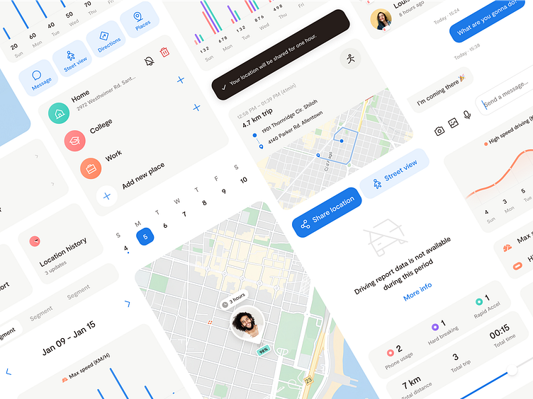
In parallel with the new screens, we continued redesigning the remaining screens of the app. A key aspect here was standardizing patterns and components to achieve a cohesive and intuitive experience.
The outcome
While working on the wireframes, we began the visual exploration. The goal was to give the app a friendlier and updated look without straying too far from its original identity. After several rounds of iteration, we achieved the desired result.
The new UI has ‘Simplicity’ and ‘Usability’ as its main pillars. We created a sleek, warm, and friendly interface with good use of white space, radial borders, soft colors, and shadows. Usability was improved by resizing and repositioning components and enhancing color contrast.
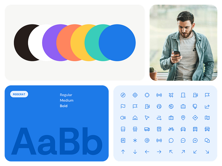
The new color palette is based on the previous colors of iSharing. We removed gradients and darkened the Blue, making it more contemporary and accessible. We added Yellow, Mint, Orange, Pink and Purple as secondary colors for more visual versatility, and a sand grey for backgrounds to provide a warm look.
Initially, we chose Moderat, a modern sans-serif font with a versatile and elegant family, as the brand's typeface. Its clean and contemporary design stands out with clear geometric shapes that enhance legibility and provide a friendly appearance. However, due to cost considerations, the client ultimately decided to use the native fonts of Android and iOS: Roboto and San Francisco.
For iconography, we replaced Material Design icons with 'Phosphor,' an open-source library with many icons. It has a friendly look and feel, consistent in style and scale, and is flexible for multiple sizes and weights.
The visual identity was expanded into a comprehensive design system to spread the new visual style across the app, providing consistency and coherence to the user interface, which greatly enhanced usability. The design system was implemented into the already formulated wireflows.
Since the implementation was handled by the client, we were meticulous with the handoff. We defined and documented specific patterns for iOS and Android, as well as the responsive behavior of the main screens.
Upon completing the new design, we created working prototypes of the newly incorporated features. These prototypes were crucial for materializing the design concepts and allowing users to interact with the platform before development. This step enabled us to test the functionality and user-friendliness of the features, providing valuable insights for further refinement and enhancement.
Leading the transformation of iSharing was a thrilling experience that broadened my perspective as a Lead Designer. This project was not just about developing an app; it was about creating a platform that allows families and friends to effortlessly share their location information, fostering stronger connections and enhanced safety.
I invite you to explore the iSharing app and experience the improved and user-friendly interface firsthand. Your feedback and interactions are truly valued and contribute to the ongoing development and refinement of the platform.
I hope the insights from iSharing's journey spark similar enthusiasm and interest in you. If this narrative connects with you, please show some appreciation with a 'Like' and let's stay connected!
Continue following my journey here and connect on LinkedIn for more design stories.
