Prospera - Investment dashboard design for you

The problem statement -
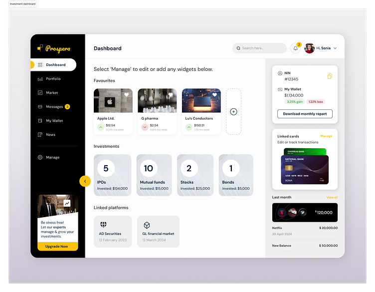
To create an overview of all my investments in one place where I can track what I have invested in, how much, and on what platforms do I have my investor details linked.
Research
Personas: A solution to an all-in-one place for my personal investments.
User Goals:
- To identify best ways to track my favorites or highly-invested stocks/companies/IPOs etc.
- To have access to my funds and National Investor Number (NIN).
- To know quantify the type of investments I hold.
Design
👁️ Visual Design: Create a sleek and modern interface without creating a sensory overload.
🔤 Content Organization: Structure the dashboard's content hierarchy logically, grouping related information.
📊 Data architecture: To present complex financial data in an easy-to-understand format - Investment type + invested funds = profit/loss. The information on the right provides an overview of mandate data and transaction history.
🟠 Color Scheme: Choose a sophisticated color palette
001F3F - Navy blue
FFC107 - Golden yellow
The navy blue and golden yellow colors create a professional and vibrant investment dashboard interface.
␂Typography: Select legible and modern fonts such as DM Sans
✅ Concluding my case study on creating Prospera while experimenting with graphics & auto-layout on Figma, and getting inspired from the community.
