Post-Market Radar
In the highly regulated field of medical device manufacturing, continuous monitoring of scientific publications for emerging risks is essential but labor-intensive. Post-Market Radar streamlines this process by searching databases, evaluate findings, and send itemized reports directly to manufacturers.
This tool significantly reduces the workload, ensuring that manufacturers can quickly address potential issues and maintain the highest standards of safety and compliance.
Initial State
As this is an existing software, the focus of the development was not on a new concept, but on editing and improving the existing infrastructure.
The existing Problems
Lack of initial design concept
Unstructured information architecture
Missed automation opportunities
Confusing and cluttered UI
Frustration and dissatisfaction among users
The Goal
Improve UX for a more user-friendly experienc
Reorganize and simplify information presentatio
Automate tasks to boost efficiency
Remove unnecessary data for clarity
Ensure user satisfaction and ease of use
User Research
We’re enhancing our software by gathering feedback from the three main admin users who use the admin UI daily. By reviewing their workflow, clarifying pain points, and addressing discrepancies, we identified areas for improvement. We're now simplifying workflows by automating repetitive tasks and focusing on essential information to boost efficiency.
Pain Points
Tables are not optimized for all screen sizes, rendering them unusable on notebooks
Information cannot be displayed in full due to screen constraints
Columns cannot be sorted for efficient data retrieval
Unnecessary information, primarily useful in edge cases, is permanently displayed, causing clutter
Vital information is not placed in the right location for user convenience
Users are often required to work with multiple tabs/windows, creating an inefficient workflow
Many workflows are unintuitive and could be automated to enhance efficiency
The software lacks user notifications for important updates or events
Users must access all information from tables without authorization
Users do not observe any progress indication when evaluating findings, causing uncertainty
Long loading times hinder user productivity
The software lacks a hierarchy of information, treating all data equally without prioritization
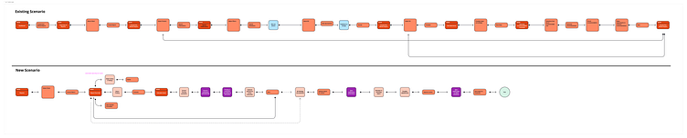
Analyzing existing User flows
Our approach centers on three pillars: process observation, task automation, and usability simplification. By closely observing user processes, we identify repetitive tasks that can be automated, enhancing efficiency. Furthermore, we're dedicated to simplifying usability, ensuring an intuitive and user-friendly experience. These pillars underpin our strategy for software improvement.
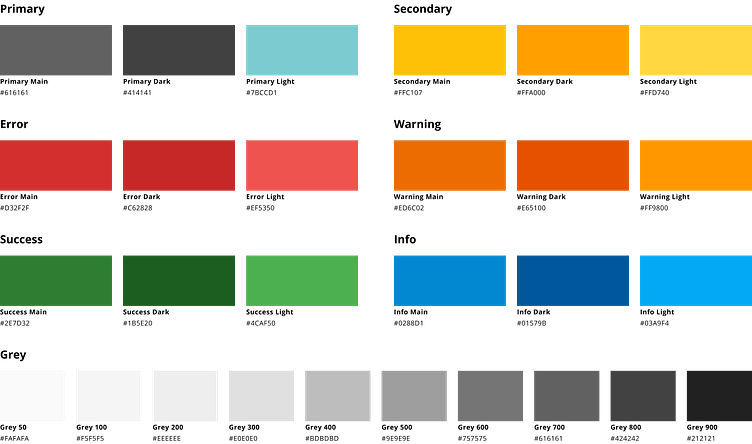
Visual Design
Post-Market Radar operates on the same platform as another other software, which recently underwent a rebranding. Post-Market Radar follows the consistent design and style guide of its counterpart. This approach enables the creation of new components that harmonize the appearance across our software suite, enhancing user experience and integration.

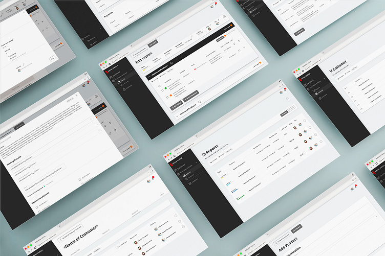
Screen Design
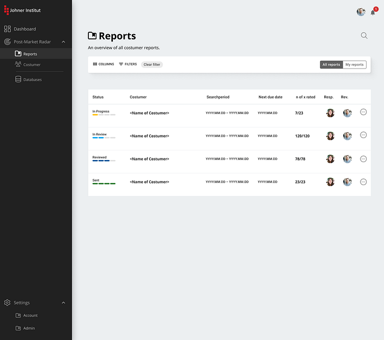
Report Overview
The Report Overview provides the consultant with an overview of all reports. Here it should be possible to see which reports are outstanding for evaluation, for which reports the respective consultant is responsible and what their status is.
Old Design
Overloaded
Too much information that is not needed (e.g. client ID)
No screen optimization
Information is not displayed completely in table columns
Table cannot be filtered
New Design
Only useful information
Preparation of information (status)
Clear presentation of all necessary information
Filterable table
Clear presentation

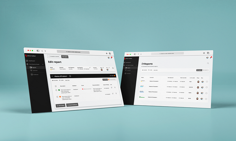
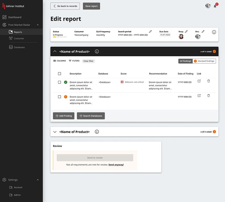
Edit report
All findings for the individual medical devices are displayed in the report itself. A preliminary assessment has already been carried out by the system. However, the findings must still be checked by a consultant.
Old Design
Unstructured information
Poor implementation on the development side
No meaningful use of the screen to display all relevant data at a glance
New Design
Better use of the display size
Clear presentation of information and the information hierarchy
Focus on the task to be performed here
Takeaway
Revising an existing product presents unique challenges compared to starting from scratch. As a designer, it was somewhat restrictive to work with a visual design I didn't create myself, and I had different preferences. For instance, the overline titles of the text input fields in MUI seemed problematic both in terms of design and usability due to small fonts.
Being the bridge between regulatory requirements and technical execution introduced new hurdles. Determining the essential information we needed was a significant challenge.
