BeGifted Brand Design
Challenge
BeGifted is launching a new brand design for its gift cards, aiming recreate the world of gift cards. The challenge is to strike a balance between making the brand look high-tech and modern, while also maintaining a friendly and easy-to-understand image which is essential to ensure that the brand appeals to a broad audience.
Research
Based on research, I found that most gift card brands have dated styles so this would be a good opportunity to create a brand that would really feel modernized and different to stand out above the competitors.
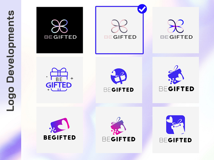
Development Stages
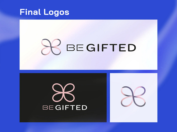
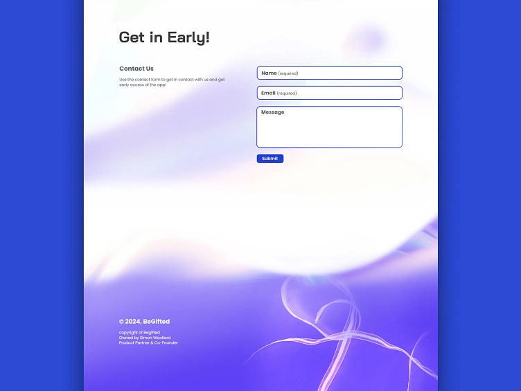
The creation of the brand logo and brand identity was the most crucial aspect of this project. I evaluated numerous logo designs and colour schemes before selecting the minimalistic logo design of the ribbon. This design strikes a balance between friendliness and simplicity, aligning with the technical nature of the brand. The brand colours were chosen to reflect the tech side of the brand, with purple being the dominant colour. However, more subtle, pastel shades of blue and pink were also included to convey a friendly yet modern feel.
Conclusion
Type: Rounded Sans Serif fonts were selected to convey a sleek and modern aesthetic, with a light style that exudes a friendly and modern yet youthful vibe.
Colour: Pastel shades were employed to evoke a tranquil and light-hearted ambience. A subtle rainbow palette was incorporated to infuse the brand with a sense of joy, while a darker purple was introduced for contrast, ensuring the tech feel remains clear.
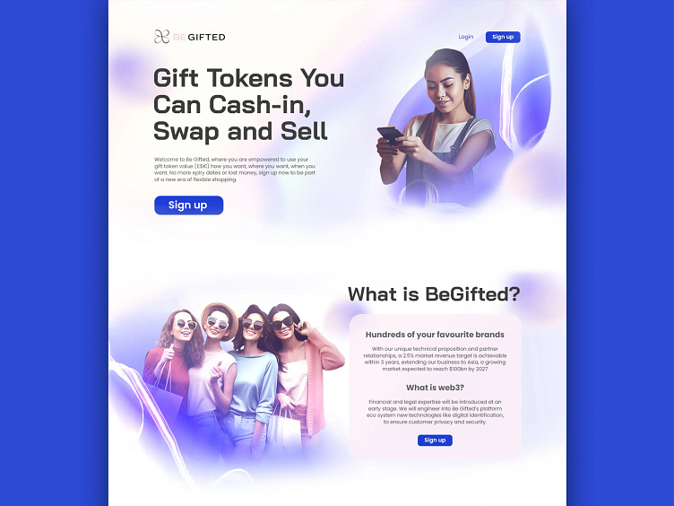
Concept: The brand uses imagery of cheerful people and a flowing wave of colour to symbolise the joy of gifting and to brighten someone's day.
