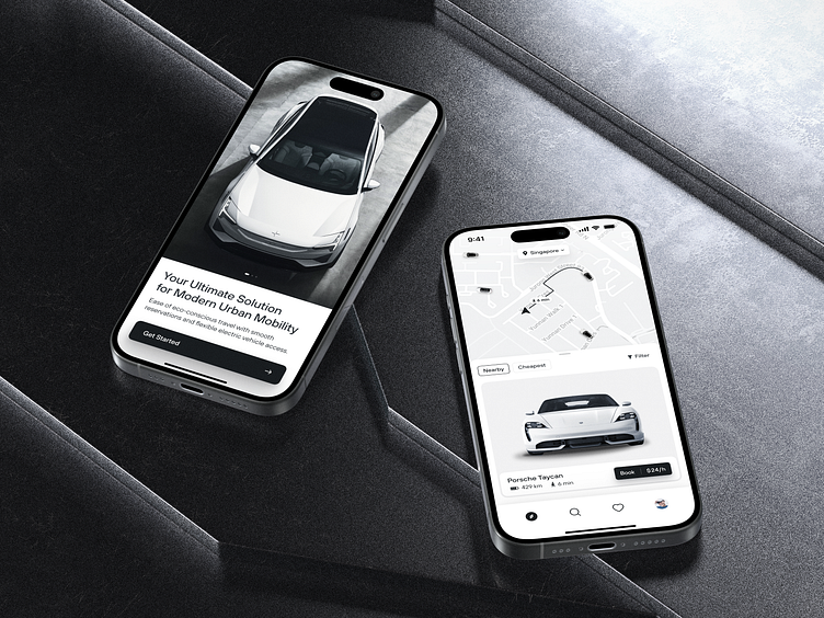
Rental App Design Concept
Gone are the days of cumbersome, confusing rental apps. Our minimalistic design ensures that all booking features are clear and accessible, saving you precious time.
This sleek and monochrome car rental app design is all about transforming the way you catch a ride. The approach we took prioritizes the user over everything. So the design allows for intuitive navigation, making it incredibly easy to browse, book, and manage car rentals on the go. Monochrome tones aren't just stylish — they improve readability and reduce eye strain. Important information like prices stands out, so you get exactly what you need without unnecessary distractions or endless scrolling. Such elements also ensure faster load times, better performance, and a breezier experience. No more hidden fees or ambiguities—just straightforward car rentals. The style also complements the minimalism trend and resembles natural materials like stone or metal. Since you rent electrocars, the ecological aspect is crucial.
Have a beautiful idea in mind? Let's collaborate!
design@shakuro.com
Shakuro
We are a web and mobile design and development agency. Making websites and apps, creating brand identities, and launching startups. Our goal is to help companies build relationships with their customers online through great design and technical performance.
Let's work together!
design@shakuro.com
Discover more about us at shakuro.com

