Data Analytics Dashboard
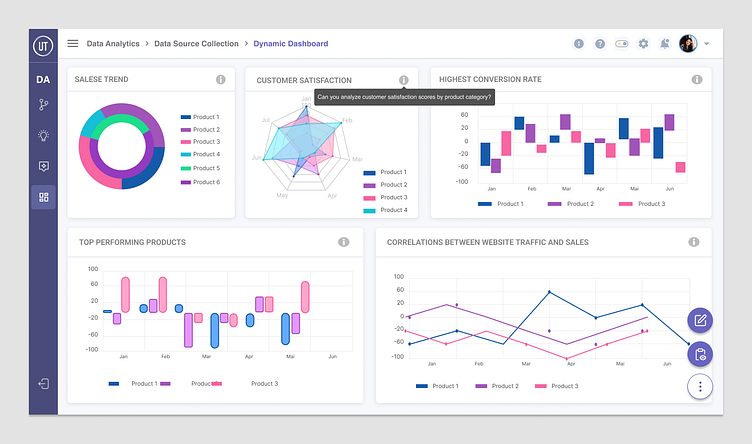
The dynamic dashboard design involved several key components to ensure an intuitive and user-friendly experience:
User Input Fields
Input fields were incorporated to allow users to type questions or queries. These fields serve as the interface for users to interact with the AI and generate data-driven insights.
Data Visualization Widgets
Various data visualization widgets, such as charts, graphs, and tables, were included to present the generated insights in a visually appealing and understandable format. These widgets provide users with a comprehensive view of the data and facilitate analysis.
AI Integration
The dashboard was integrated with AI capabilities to process user queries, analyze data, and generate insights dynamically. This integration enables the dashboard to respond intelligently to user input and provide tailored recommendations and visualizations.
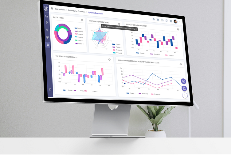
Responsive Layout
A responsive layout was implemented to ensure that the dashboard adapts seamlessly to different screen sizes and devices. This allows users to access and interact with the dashboard across desktops, tablets, and mobile devices with ease.
Interactive Elements
Interactive elements, such as clickable buttons, drop-down menus, and draggable components, were incorporated to enhance user engagement and facilitate navigation within the dashboard. These elements enable users to interact with the data and customize their dashboard experience.
Accessibility Features
Accessibility features, such as alternative text for images, keyboard navigation support, and high contrast modes, were implemented to ensure that the dashboard is accessible to users with disabilities. These features enhance inclusivity and usability for all users.
By incorporating these elements into the dynamic dashboard design, the aim was to create a user-centric and versatile platform for data exploration, analysis, and decision-making.
Tools used
Figma
