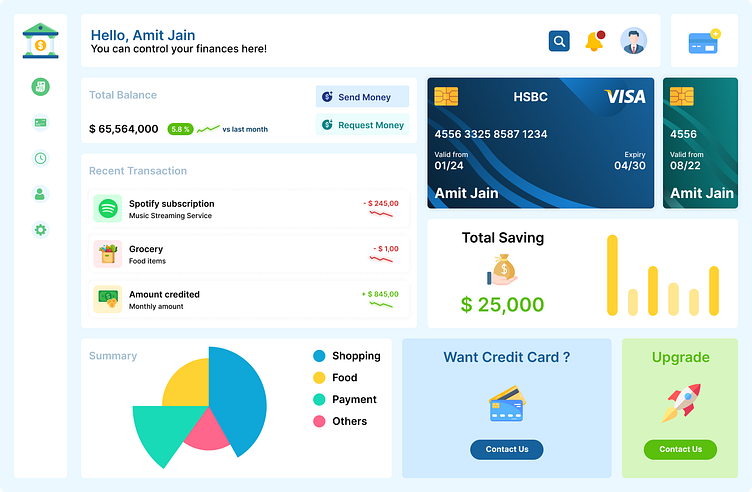
Finance Overview Dashboard Design
Introducing a sleek and intuitive Finance Overview Dashboard designed to provide a comprehensive snapshot of financial health. This dashboard is perfect for financial analysts, accountants, and business owners who need quick insights and detailed financial data at their fingertips.
Key Features:
Total Revenue and Expenses:
A clear and concise summary of total revenue and expenses with a month-over-month comparison to highlight trends and growth.
Net Profit Margin:
Visual representation of net profit margin to help assess profitability. Includes historical data for performance tracking.
Cash Flow Analysis:
Detailed cash flow charts to monitor inflows and outflows. Segmented into operating, investing, and financing activities for a comprehensive view.
Expense Breakdown:
Pie chart displaying a detailed breakdown of expenses by category. Easily identify major cost centers and manage budgets more effectively.
Revenue Streams:
Bar graph showcasing different revenue streams and their contributions to total income. Ideal for identifying high-performing areas and potential growth opportunities.
Financial Ratios:
Key financial ratios like Current Ratio, Quick Ratio, and Debt-to-Equity Ratio displayed in an easy-to-understand format to assess financial stability.
Top Performing Products/Services:
Highlight the top-performing products or services with their respective revenue contributions. Helps in strategic decision-making for inventory and marketing.
Budget vs. Actuals:
Comparative analysis of budgeted vs. actual financial performance. Visual indicators for variances to ensure better financial planning and control.
Love this design? Hit the 💖 button and follow for more UI/UX inspirations! Your feedback is highly appreciated. Share your thoughts in the comments below!
