Jagongonten Logo Design

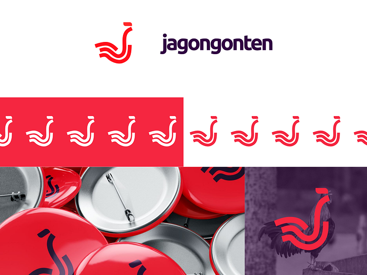
The Jagongonten Agency logo is a creative and symbolic representation inspired by the Indonesian word "jago," meaning rooster. This logo incorporates key elements:
Rooster Symbolism: Reflects vigilance, confidence, and readiness.
Initial 'J': Personalizes the logo, connecting it directly to Jagongonten.
Flexibility and Modernity: Showcases the agency’s adaptability to trends and innovation.
Color Orange: Represents the boldness and courage of a rooster, emphasizing the agency’s fearless approach.
Overall, the logo embodies Jagongonten Agency’s values of vigilance, uniqueness, adaptability, and boldness, ensuring its relevance and impact in the design and marketing landscape.
Full presentation in https://www.behance.net/gallery/199013131/Jagongonten-Logo-Brand-Design