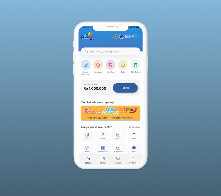
Pasar Online Lamongan "POL" - Revamp Mobile App Design
Hi everyone..
Today I share the results of my work on UI/UX Design.
Revamp Mobile App Design Lamongan online market "POL" is the result of my work in conducting UI/UX Design analysis of POL applications.
here is the link for the original application: https://play.google.com/store/apps/details?id=pkg.polcustomer.com&hl=id&gl=US
Hope you like it. Thank You
Project Brief
Problem
There are several problems related to User Interface Design, especially design principles and basic visual elements.
Role
Conduct user research to find domain knowledge
Focus on making lo-fi and hi-fi landing page
Duration
1 day
Research
Domain Knowledge
"Pasar Online Lamongan" is an online shop application created to develop MSMEs in the Lamongan area. This application has the goal of helping Lamongan UMKM players in expanding their market and increasing their sales turnover through online sales.
The main goal is to make it easier for users to meet their needs, mainly by implementing design principles and UX Laws.
Challenge
Users use a variety of different platforms
Need to use the right elements without compromising the company's branding.
Before Design
UI Problem
Logo sizes are inconsistent
There is space for a banner, but no information is conveyed
Inconsistent use of icons
The use of copy writing is still not good
Inconsistent use of card design
Inconsistent use of color on buttons
Too much information to display, doesn't focus on the usefulness of the apptext here...
After Design
Quick search is more specific.
Options are reduced to make the user focus on what is needed.
Users may be interested when they see the MSMEs from Lamongan on offer.
It seems simpler and easier to navigate.
Evaluation
Challenge
Inconsistency in font size and whitespace may still be too large.
What can be improved?
When designing it is necessary to pay attention to as much detail as possible, such as alignment and other elements.
What's next?
Need to learn more about basic UI and try to implement it more deeply.xt here...


