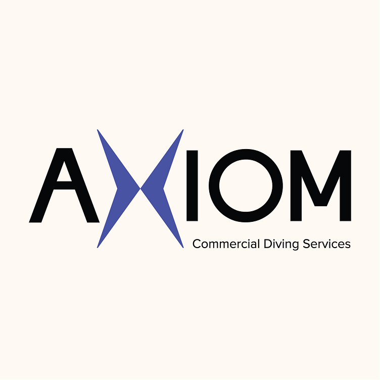
AXIOM Commercial Diving - Official Logo
AXIOM Commercial Diving - The Brief
The Brief: Craft a simple, legible, and suitable logo for a new business venture into the commercial diving industry. Utilize colors often seen in diving, but also make it stand out from the overly-industrial competitions' logos.
The Solution
I utilized a flag often seen in commercial diving, called the Alpha flag. The Alpha Flag's blue shape creates a natural X that I utilized in the logo. This stands as the brand mark for the company that will become recognizable with continued use.
I used the definition of the word "Axiom" ("a statement or proposition which is regarded as being established, accepted, or self-evidently true.") as the core for the logo's identity. I chose a strong, monospace font that takes up space and demands curiosity. It's simple, so it can go on a variety of backgrounds and peripherals, identifiable, so it stands out among the competitors' logos in a brochure, and maintains the integrity of the commercial diving industry's identity.
Axiom's Official Style Sheet
How to use the logo, how not to use the logo, and any other information pertinent design information for the client.


