OUT app
(ABOUT)
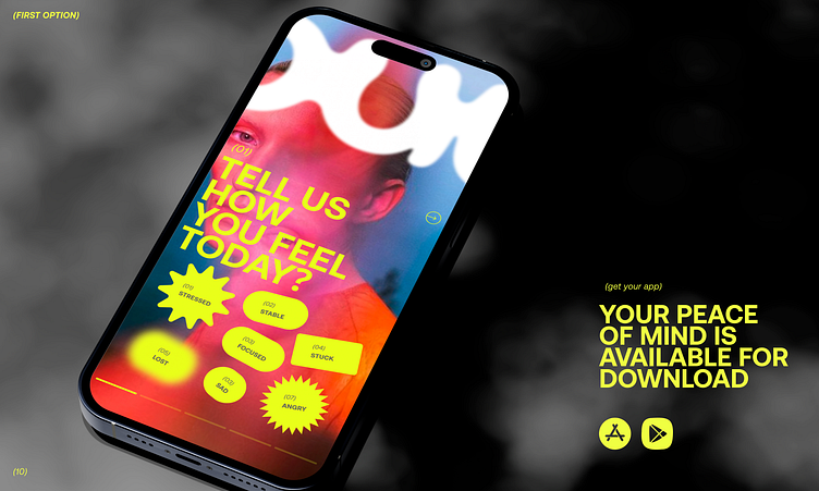
In this design option we want to use one palette, one tonality, more yellow light colors, a lot of blur. Blur, it is also used in photos and figures. Yellow — is the color of energy so here it is used more often in the percentage. The logo can also be blurred and hidden a bit
More by Kristina View profile
Like


