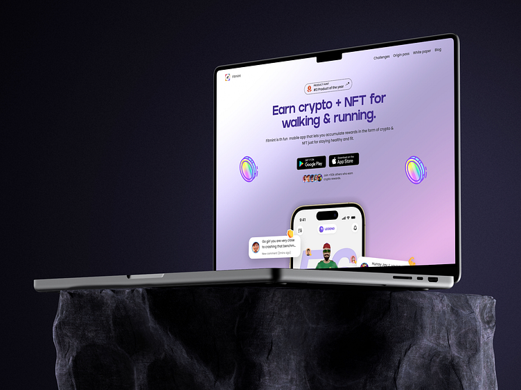
Landing page redesign - Fitmint
Snap shot of the new conversion-focused web redesign for Fitmint
The Improvements:
Product hunt award/badge now stands out
A new headline but more specific
To-the-point subheading - further telling the benefits
2 Call-To-Action buttons that now stands
Added social proofs below the CTAs - to further drive conversion.
Show-not-tell... a glimpse show of what the app looks like
Improved design
New to my profile?
Hi there! 👋
I'm Samuel - UI/UX design partner for Founders & Startup companies.
I design websites, mobile apps and high-converting landing pages for founders and startups.
========================================
Got a project idea?
I'd love to work with you.
Shoot me a message here on dribbble or reach out via email at:
Thank You! 😊
More by Samuel Nathaniel View profile
Like


