Saas Library - Landing page redesign
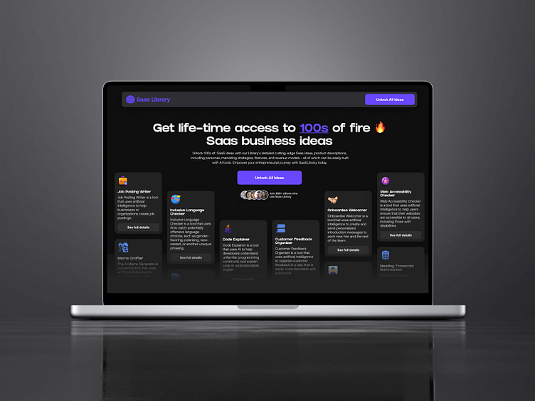
Snap shot for Saas Library's conversion-focused landing page re-design.
The Improvements:
A new benefits-focused headline.
To-the-point subheading - further telling the benefits
From "Call-To-Action" to a "Call-To-Benefits" button
Added some Social proofs below the action button
Show-not-tell - shows the visitor a glimpse of the "Saas business ideas" they'll be getting.
Improved design
New to my profile?
Hi there! 👋
I'm Samuel - UI/UX design partner for Founders & Startup companies.
I design websites, mobile apps and high-converting landing pages for founders and startups.
========================================
Got a project idea?
I'd love to work with you.
Shoot me a message here on dribbble or reach out via email at:
Thank You! 😊
More by Samuel Nathaniel View profile
Like


