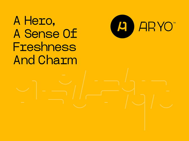
ARYO Perfume / Logo & Visual Identity Design
During the meetings held with the brand strategy leader, the focus in designing the logomark concept was on the best features of the brand. In addition, according to the archetype of the brand, while being a hero, we must implement and instill the boldness and appeal of the brand in the form. Considering the field of activity of this brand, which is currently producing perfumes with new and exclusive scents, but contrary to expectations, we did not use elements related to this field! Because in the near future, due to the expansion of this brand's field of activity in the fields of clothing production and luxury bag production, there was a need for a personal and memorable symbol, which was finally used from the concept you read before! A combination of the number one + and the letter A. The result was created by combining the color yellow to further emphasize the boldness and attractiveness of the brand.


