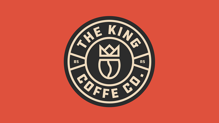
The King - Coffee Co.
REDEFINING COFFEE CULTURE IN BUENOS AIRES
The King, a new coffee shop nestled in the heart of Buenos Aires, seeks to revolutionize the local coffee culture. With a blend of modern minimalism and a touch of retro flair, The King offers an inviting space for coffee enthusiasts to indulge in their favorite brews.
OBJECTIVES
The objective was to create a brand identity that reflects The King's unique blend of modernity and retro charm. The design needed to be versatile enough to work across various applications while capturing the essence of the coffee shop's ambiance.
THE SOLUTION
To capture The King's essence, I opted for a modern minimalist approach with a touch of retro styling. The logo features a sleek wordmark design paired with a crown icon badge, symbolizing royalty and quality.
For versatility, I created a set of designs including badges and alternate wordmark variations. These variations allow The King to adapt its logo to different environments, from storefront signage to social media profiles.
The chosen color palette of muted red, black, and cream adds sophistication and warmth to the brand. The muted red represents passion and energy, while black adds a touch of elegance, and cream brings a sense of comfort and warmth.
CONCLUSION
With its modern minimalist design and retro-inspired elements, The King's brand identity stands out in Buenos Aires' competitive coffee scene. The versatile logo and carefully curated color palette create a cohesive and memorable brand experience for customers. As The King continues to grow, its distinctive identity will serve as a cornerstone of its success, inviting coffee lovers from near and far to experience the royal treatment.


