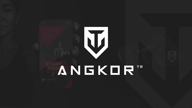
Angkor - Brand Identity
A CROSSFIT CENTER BUILT UPON THE VALUES OF STRENGTH, ENDURANCE, AND COMMUNITY.
OBJECTIVE
EnThe word "Angkor" originates from the Sanskrit "nagara" (नगर), meaning "city". The client aimed to convey a sense of community behind the brand name, while the symbol itself needed to evoke strength, akin to an anchor, due to its similar pronunciation.ter your text here...
THE OUTCOME
Crafting a visual identity that encapsulated Angkor's core values while extending beyond traditional workout references presented a challenge. The client desired a modern, geometric, and minimalist design. After careful consideration and exploration, a bold design featuring an anchor as the central element alongside the brand name emerged.
CONCLUSION
The final brand identity for Angkor successfully captures the essence of strength and community while adhering to the client's vision for a modern, minimalist design. The incorporation of cultural elements adds depth and resonance to the brand's identity, establishing a strong foundation for its presence in both physical and digital spaces.


