Credit Card Checkout Design
Project Description
This is part of my pivot from web development into UI/UX design. In this project I take on a series of design challenges taken from various UI/UX courses, blogs, forums etc. with the aim of "implementing" these designs in the most functional and user-centered way possible. My ultimate goal is, to become not only a UX-specialist but also add UI design & development to my skillset.
The Brief #1
Design a credit card checkout form or page. Don't forget the important elements such as the numbers, dates, security numbers, etc.
Target Platform
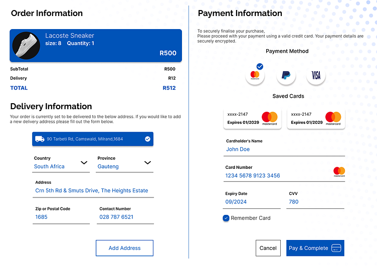
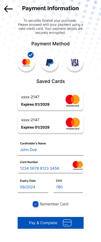
I decided to go with a full-page web design and also included a mobile design with just the credit card checkout only as well. The full-page design was made to see how the credit card checkout form would fit alongside an order details confirmation form.
User-Centered Design
Target User: first time buyers or frequent buyers it should be simple enough that someone who has never interacted with a credit card checkout page should easily navigate through the page and the process.
User Goals: completing the purchase quickly and simply, and feeling secure about their information.
Potential Pain Points: confusing form layout, unclear or ambiguous call to actions, and unclear error messages
Functional Design Decisions
What problem am I trying to solve with my design?
Creating a clear and simple checkout experience for the user.
Simplifying the flow from the order to the payment.
Making the design accessible to new and experienced users.
How does my design address the user's needs and pain points?
my main focus in this design was visual clarity, easily seeing where everything is and what everything does with clear labels and an intuitive layout.
there are intuitive elements such as the remember card checkbox, and the call to actions but these could also end up being pain points if not user tested.
What visual hierarchy and layout did I choose? Why?
Two column layouts for the web design with a Z shaped reading pattern
one column layout on mobile with E shaped reading pattern
The design uses a 12-column grid system to help arrange and layout the elements on the page and prepare it for responsive design.
How did you choose the color palette, fonts, and icons?
color palette was just one base color #0053B8 I wanted to use just one color for this design so the focus was not vibrance it was just function and accessibility
The fonts used are Raleway and Inter, two complimentary sans serif fonts. Raleway was used for the headings and subheadings in bold variations, and Inter for the body copy in bold, regular, and thin variations.
Icons used came from iconify and are a combination of outlined and filled icons I understand this might not be "consistent" so in future I will try and use the same icon type throughout the application. In my defense the only outlined icon is the credit card in the pay & complete call to action 😉
What are the key interactions or functionalities of my design?
Currently for this brief this design is fully static so I did not add any variations, animations, or effects but I will in future when i revisit this design
Technical Design Decisions
Form Layout:
My form is stacked vertically with only the credit cards security info grouped by type being the expiry date and CVV
Visual Hierarchy:
The headings are used to inform the user that they are in a particular section of the entire order process i.e., "Order Information", "Delivery Information", "Payment Information"
Under payment information the size of the sub headings in comparison to the headings lets the user know that you are now providing information for this particular section.
I also centred the subheadings to kind of break the alignment of the headings to the subheadings to direct their eyes to the center of the screen where the interactable elements are located
The colours are used to draw the users’ eyes to the very important aspects of their order.
The Order Total is in blue, along with the product they ordered.
The delivery address is also in blue to draw the user’s attention to it.
The checkmark on the payment method is blue to call attention to its selection, the saved cards will do the same if selected.
The form input values are in blue so that the user pays attention to them when entering.
The aim is to guide the user’s eyes through the sections but also allow them to note the priority of the information as they go through the form.
Input Fields:
Floating inputs for the text
Floating dropdown inputs for the country and province
Floating Password inputs for the CVV, Expiry date and Card Number
could also add a button that allows the user to see the values they have entered in the security fields
Or allow the user to see their entered details using regular Floating Inputs
Solid color button for the primary payment completion action because we want the user to focus on that specific button and outlined buttons for the secondary actions such as adding a new address or cancelling the order
Checkbox for the remember card action
Custom made cards for the product and delivery information
Custom made radio input group for the payment methods
Custom made radio input group for the saved cards
Error Handling:
This was not handled in this design but will be in future
Security:
trust seals on the payment method bubbles and in the card number input to afford users the peace of mind that they are using secure payments
Should also add validation after the user types in their credit card info to further provide that affordance of security
Call to Action:
The main primary call to action here is the Pay & complete action that is where the user will proceed after entering in their credit card information.
Additional Considerations
Accessibility: This was one of the more difficult decisions to make in the design because I had to battle with "I like this color" versus "This is the color I should be using for accessibility purposes". I managed to find a shade that I was happy with that still followed color contrast guidelines, and I chose to use only that one color across the various elements of the design. I also then relied on the icons and images to add accent colours across the rest of the page design.
Branding: #0053B8 is the main color used throughout the application no specific branding is provided.
Mobile Optimization:
Payment call to action is clear and large and takes up its own space at the bottom of the form to avoid mis taps.
Cancel call to action moved to the top left and changed to a back icon
Payment method bubble call to actions remain circular easy and easy to tap including the saved cards.
Final Full Page Design

Final Mobile Design
Conclusion
In terms of the brief given the designs presented cover all of the requirements requested which was to Design a credit card checkout form or page. while also focusing on the importance of elements such as the numbers, dates, security numbers, etc.
Feedback
Please feel free to add any feedback, critique, or opinions on the design that I can use going forward. 😁
