POULTRY PHARMA | LOGO DESIGN & BRAND IDENTITY
Poultry Pharma offers a comprehensive range of nutritional supplements, essential oils, acids and poultry health products. Each Poultry Pharm product is carefully developed by veterinarians and nutritionists, and scientifically tested and tested.
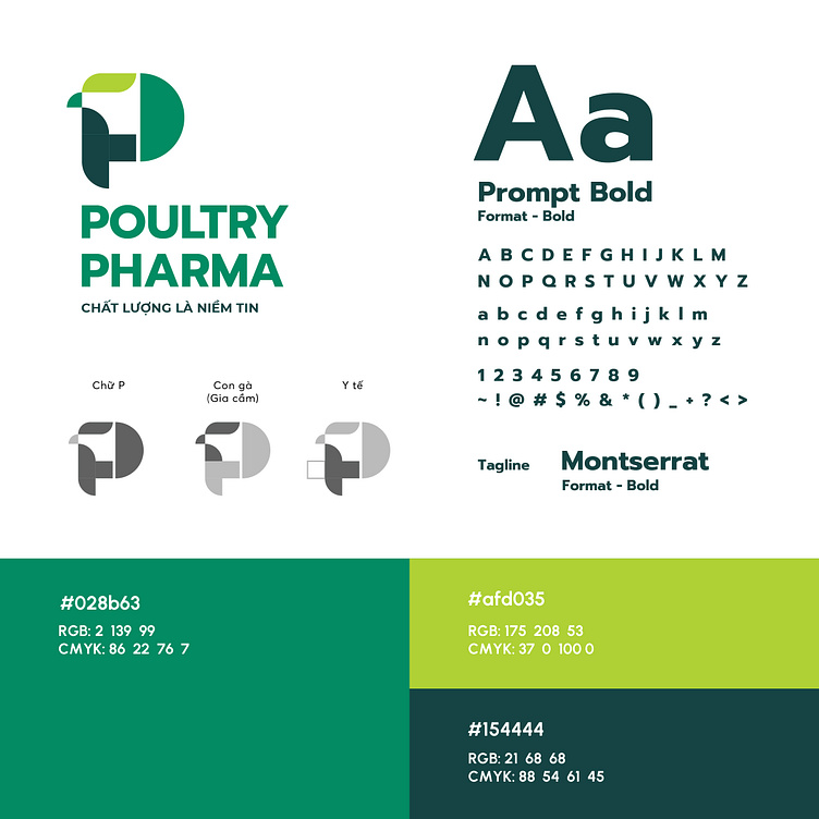
Designing the logo and brand identity for Poultry Pharma, Bee Art chooses green color with many different shades to convey the message that the brand wants to send to customers. Green is a symbolic color for health and healing. In the field of poultry health, this can emphasize the safety and effectiveness of poultry health care measures. If dark blue represents reliability and professionalism, light blue evokes a sense of positivity, optimism, creativity and friendliness, making customers feel comfortable and secure when using the service.
The logo design of Poultry Pharma is made up of many shapes, cleverly integrated together to create many meanings. The logo symbol is a combination of the image of a chicken, a medical cross, and the letter P in the brand name. The image of the chicken and the medical cross represents the brand's field of activity, while creating a connection and evoking emotions with customers. The simple sans serif font is clearly suitable for the medical field.
Designed by Bee Art
-
Client Poultry Pharma
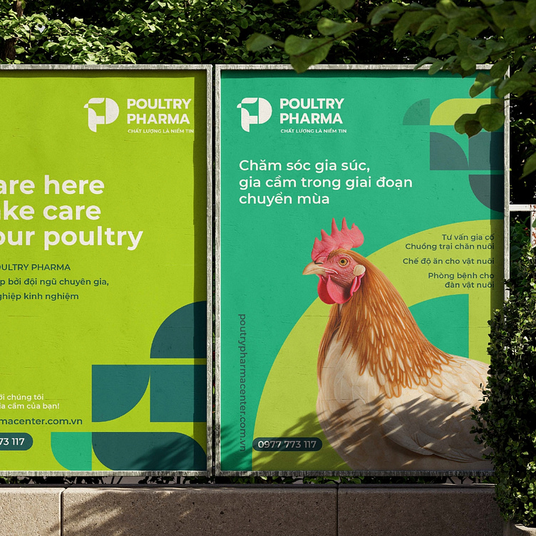
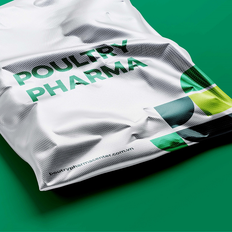
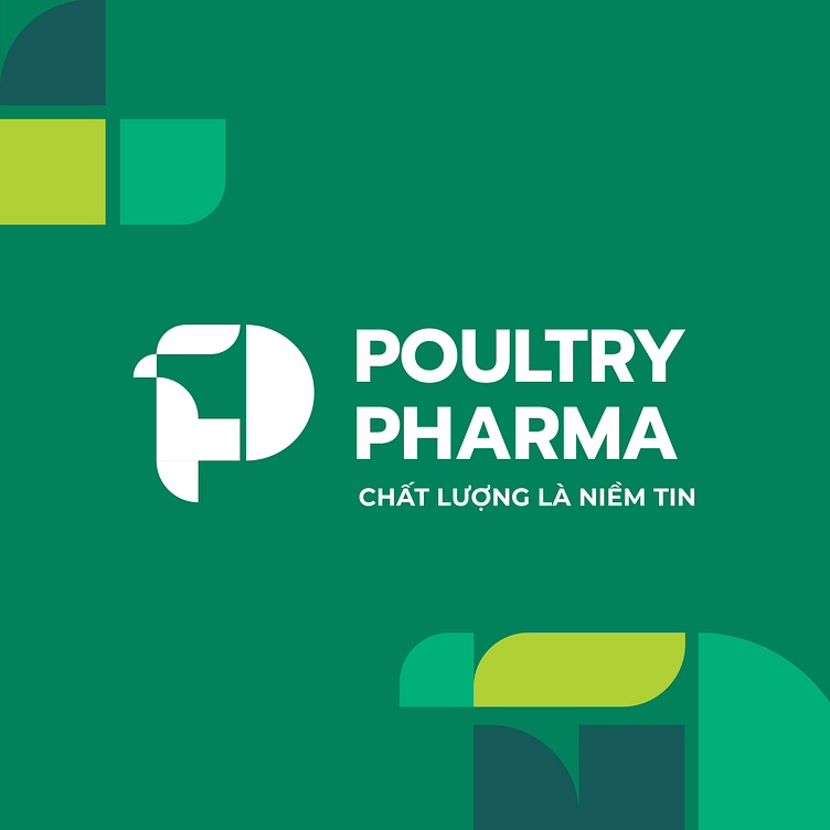
Logo and Branding Project. Logo is designed for Poultry Health Brand in Vietnam.
Copyright© Bee Art. All Right Reserved
Contact us:
• Hotline/ Zalo: (+84) 77 34567 18
• Email: info@beeart.vn
• Website: www.beeart.vn
• Facebook: https://www.facebook.com/BeeArt.vn