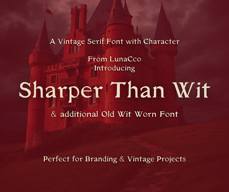
Sharpen Than Wit & Wit Fonts
I am almost done with my first set of fonts covering the key styles that I love and use daily. Sharper Than Wit is a nice sharp serif with a slightly gothic feel. This is perfect for fantasy and historical branding and books as well as a number of vintage style projects.
After finishing my razor sharp serif, I wanted to see how it would fair a bit softer as if aged or worn down plates. I was not disappointed at all, the result gives a nice old book feel. With both you have a wide range of possibilities. I included two of my pre-made logos using both fonts to show their use in branding which I love!
More by Julia "Jules" Duquette View profile
Like


