Tech Startup Brand Identity Project
Wave is an innovative tech company dedicated to developing cutting-edge software solutions for businesses across diverse industries.
Logo Design
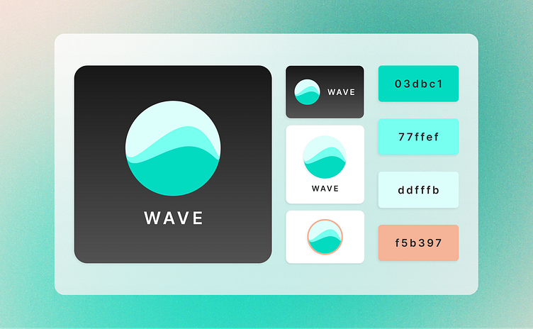
The Wave logo features a circular design with smooth, flowing lines, evoking a sense of movement and fluidity. The gradient of turquoise and mint green symbolizes calm energy and growth.
Color Palette
Turquoise (#03dbc1): Primary color symbolizing innovation and clarity.
Light Aqua (#77ffef): Adds a fresh, airy feel.
Soft Mint (#ddfffb): Provides a gentle, calming background.
Peach (#f5b397): Warm contrast for highlighting elements.
Wave’s brand identity is approachable, innovative, and professional, with a refreshing color palette and fluid design elements that position it as a forward-thinking tech company.
Typography for Wave
Wave uses the Inter typeface, selected for its clean and modern look, which perfectly complements the brand's innovative and forward-thinking identity.
Inter Typeface
Inter Semi Bold:
Usage: Headlines, key messages, and important text elements.
Characteristics: Bold, clear, and highly legible, ensuring that important information stands out and captures attention.
Inter Light:
Usage: Body text, secondary information, and detailed descriptions.
Characteristics: Elegant and refined, providing a smooth reading experience that balances the boldness of the semi-bold type.
Website Preview
The Wave website preview presents a modern and visually appealing design that effectively communicates the brand's innovative spirit.
The use of bold typography, a cohesive color palette, and strategic placement of the call to action button ensures a user-friendly and engaging experience. The design is responsive and optimized for both desktop and mobile devices, ensuring a seamless user experience across all platforms.


