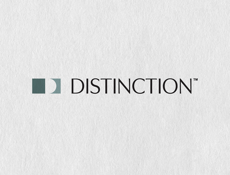
Distinction™ Logo Redesign
Distinction™ is a speaker coaching business based in Oregon.
Our mission was to refresh the Distinction™ logo to reflect its true personality.
〰️
BRAND VALUES Honesty / Clarity / Authenticity / Humanity / Relevancy
〰️
BRAND AESTHETIC Simple / Approachable / Clean / Engaging / Professional
〰️
The speaker coaches’ craft is to shape the unremarkable into the unforgettable. The rectangle on the left is typical. The rectangle on the right has curves, varied widths, and tapered edges carved within. Distinction is “a difference or contrast between similar things”—exactly what this symbol illustrates. The arrangement is designed to represent the difference that Distinction™ delivers. It intentionally creates an uppercase “D” in the negative space, reinforcing the company’s initial.
I especially enjoy the font, which is humanist-style (modeled after classical Roman capitals). It contains a degree of unevenness common in calligraphy. This characteristic nods to human involvement in the typography.
Before:

