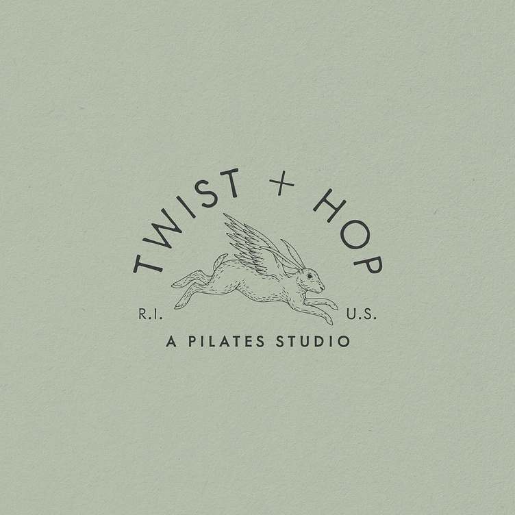
Twist + Hop Branding (Unused Concept), 2023
One from the cutting room floor for a Rhode Island pilates studio. The overall aesthetic for the brand identity is historic, earthy, and gritty. We used an etched / engraved style of illustration for the hare logomark. We focused on the deeper meaning of a hare, as a symbol of fitness, feminine energy, movement, new beginnings, and equilibrium. With the wings giving it an uplifting power. Scroll for alternative lockup, submarks, and patterns.
More by Nicole Sgroi View profile
Like


