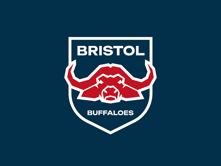
Bristol Buffaloes FC - Logo & Visual Identity Design
Bristol Buffaloes FC are a football team based in Bristol. The buffalo represents the team’s values - courage and resilience (these traits are shared with the animal). It’s said that a wounded buffalo often runs towards rather than away from its attacker. They also live in large herds which can sometimes put off dangerous predators. In the same way, Bristol Buffaloes stick together when they’re on the pitch and don’t shy away from ‘dangerous’ teams, even though the odds may be stacked against them.
Their logo had to symbolise these values and as a result, the buffalo in the design has been made to look tough and intimidating. This was achieved by the use of sharp corners and angles in the shapes that make up the buffalo’s head. The colour palette further adds to this effect due to the colour connotations of red, linking to aggression.


