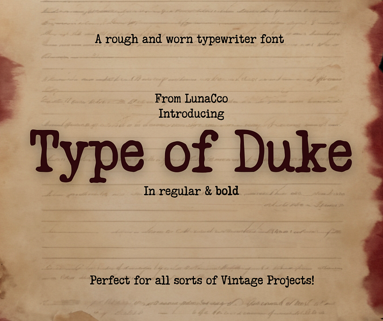
Type of Duke Typewriter Font
I use typewriter fonts A LOT. Maybe too much, to be honest. 3 of my oracle/tarot decks have a typewriter font for the design. As we ready to put those up for sale officially, I wanted to be able to refresh the designs to my fonts only. It makes sense if I'm doing fonts that I should promote both my decks and the fonts at the same time. It felt like a Ford mechanic driving a Chevy otherwise!
So, a typewriter font had to be amongst my starter fonts without a doubt! I use them in many of my planners as well. There is something cozy, vintage, and easy to read about a good typewriter font. Like well-worn pjs that are perfect for any weather!
I had penned the whole thing, very rough after vintage slab and typewriter alphabets. I then softened the whole thing with the smooth tool in illustrator just enough to give the harsh edges a rounding and the over all feel more well loved! And offset the baseline to give some variation similar to the keys hitting the paper.
The result is a soft but rough typewriter look and feel that maintains readability. A distressed effect could easily be applied to get more variation but was avoided in the standard font to avoid heavy files.

