FansUp / Case study
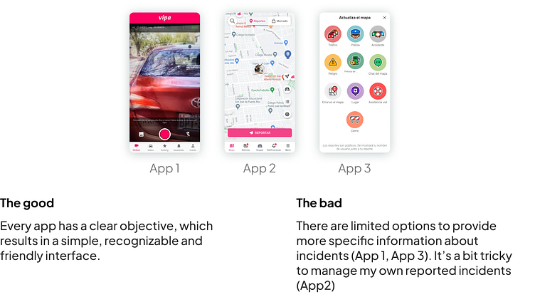
Competitive analysis
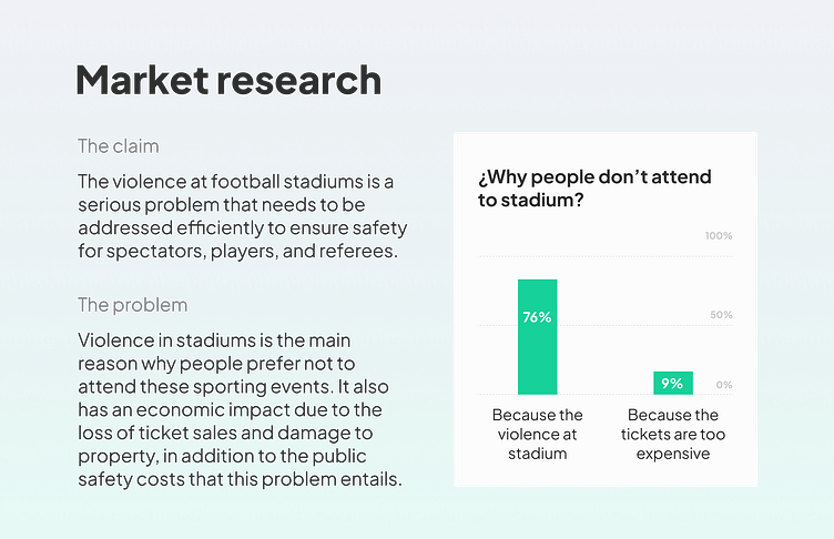
I analyzed 3 apps that are in the same category and offer similar functions. Paying attention to the interface, interaction, and structure design. Additionally, I reviewed the comments looking for patterns.
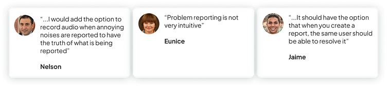
Problems found on comments
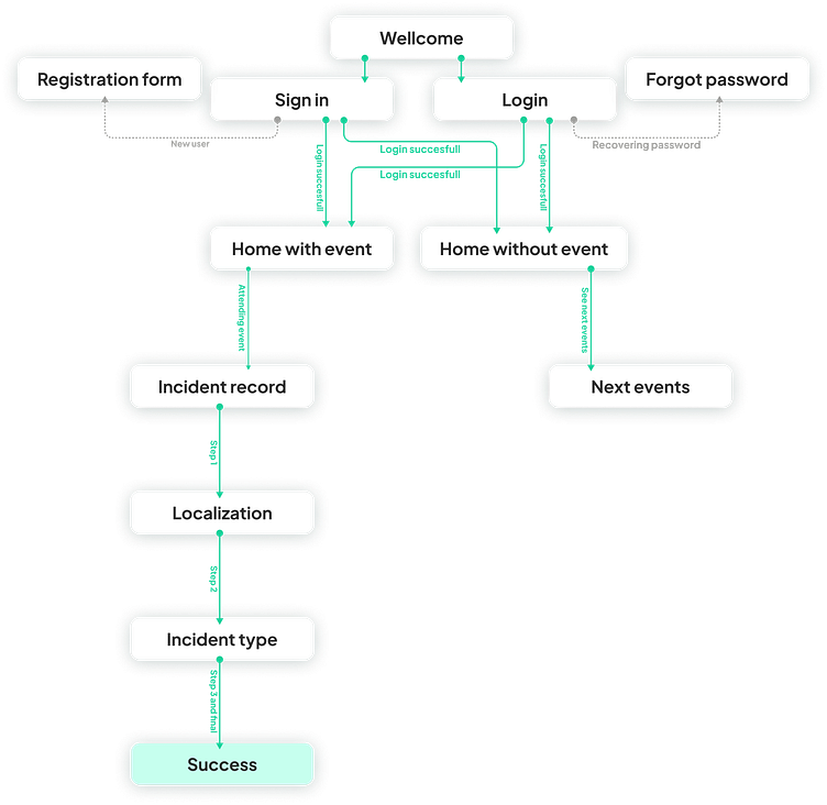
Flow diagram
I've devised a straightforward flowchart illustrating the primary user actions to delineate all the essential functionalities. An example of one such flow is depicted below.
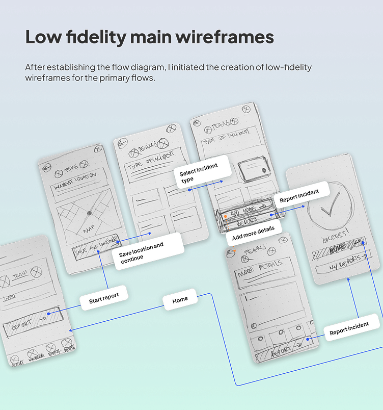
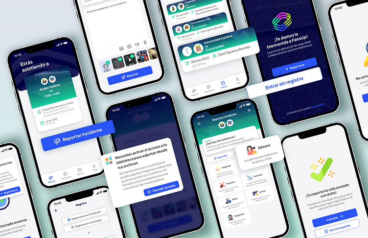
High-fidelity UI Design
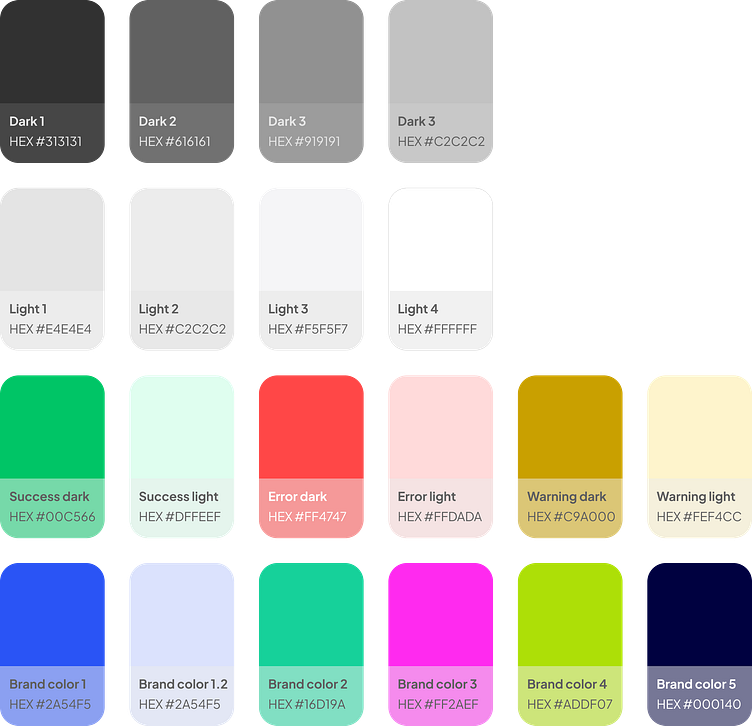
Once the main initial flow was complete, I began by creating a couple of the main screens of the app. Defining fonts and color palette is an important step at this point.
Color palette
Font

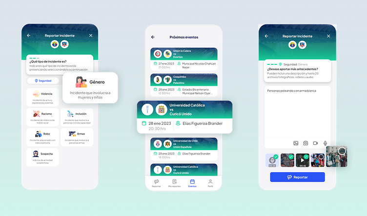
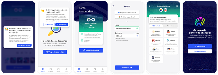
53 High-fidelity designs were created
Incorporating the critical interaction flows, which underwent testing with real users at a later stage in the design process, ensures a comprehensive evaluation and refinement of the user experience.
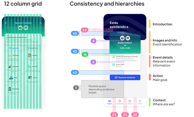
Alignment and grid
Using a 12-column grid in mobile design provides flexibility and consistency in content distribution across various devices. This facilitates the creation of visually appealing and optimized layouts, ensuring a consistent user experience across different screen sizes.
8px grid in interface design has numerous advantages for app development. Maintaining consistency throughout each design view ensures precise alignment and visual harmony across all elements. This grid facilitates scalability across devices, ensuring a cohesive and pleasing user experience. Its clear guidelines for spacing and sizing result in more readable, organized, and visually appealing interfaces.
These rules are reflected throughout the entire interface design of FansUp.
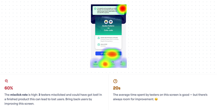
Usability testing
This usability test stems from the need to evaluate the clarity of navigation and usability in the incident reporting flow at a sports event.
Below are the results of the success view after submitting the event report and the various observations from the users:
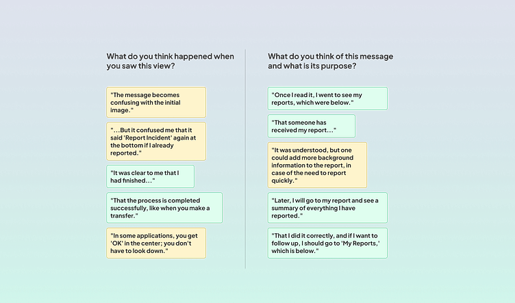
To see the full results of this usability test, click here. Note that these results are in Spanish.
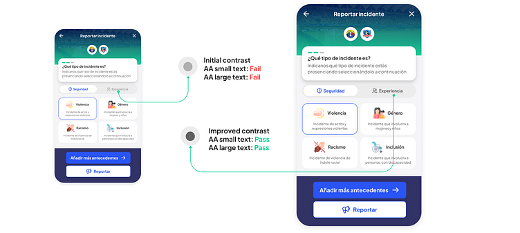
Accessibility check
I've assessed the app's contrast to meet the AA standards of WCAG. However, I've identified areas where the contrast could be enhanced.
An example of this is the following case: in the application, there is a tab that allows you to choose between 2 reporting areas, Security or Experience. When one of the two is active, the other is deactivated. I noticed that the deactivated case was barely perceptible to users, so they either didn't see it or found it very difficult to read. For this reason, the following improvement was made: