BRUTUS | Identity Design, Packaging Design
NOVEMBER | 2019
CATEGORY: Identity Design, Packaging Design
PROJECT TYPE: Freelance Project
CLIENT: Brutus
PARENT COMPANY: Muralo Chemicals and Paints Pvt. LTD.
IMAGES USED ARE TAKEN FROM SOURCES SUCH AS THE INTERNET
THE BRAND:
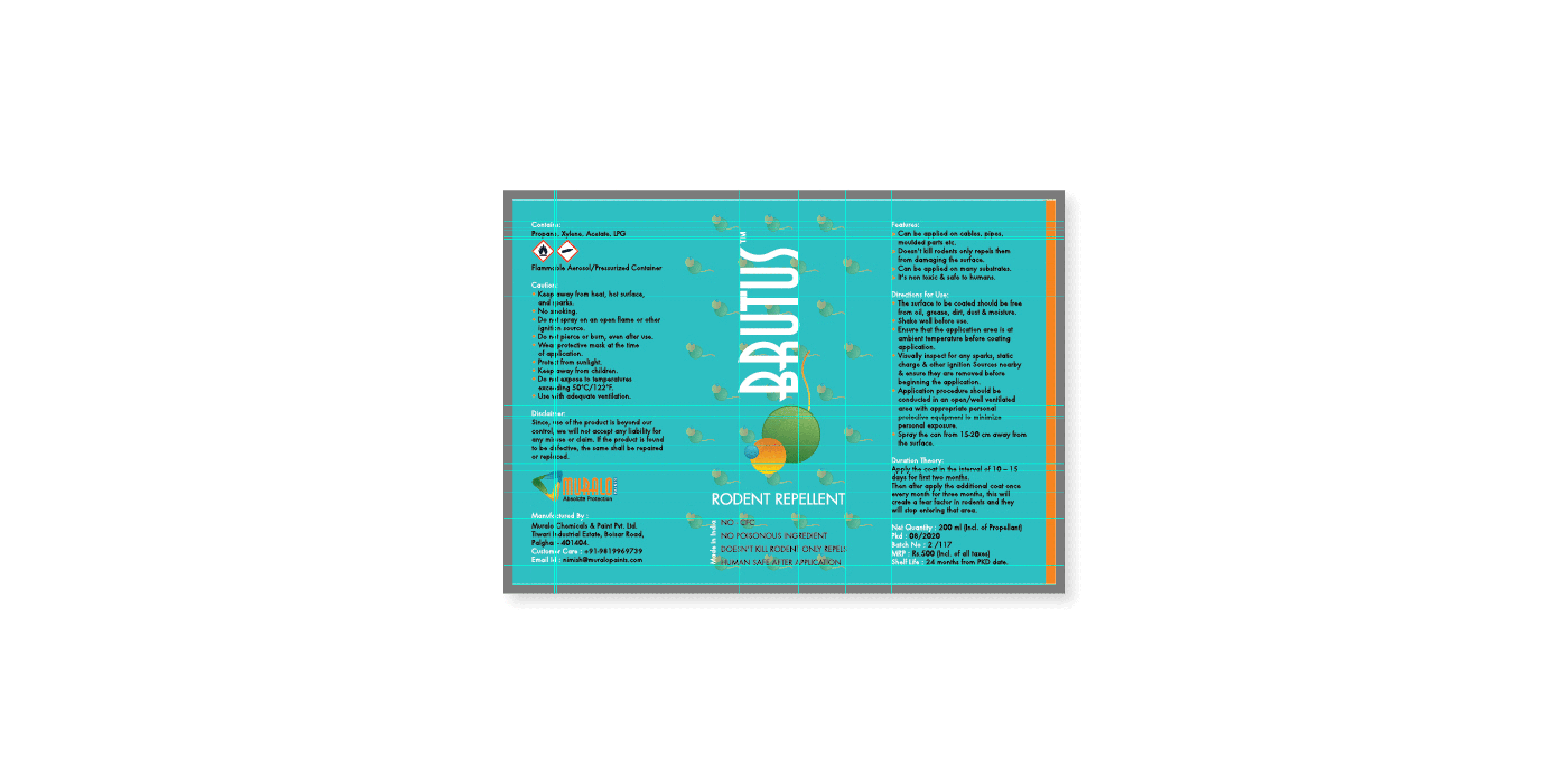
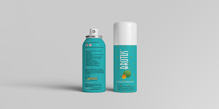
BRUTUS was an online product line, a repellent, launched by its parent company, MURALO Chemicals and Paints. The aim was to integrate the visual language of the parent company into BRUTUS's identity and product range.
THE DESIGN:
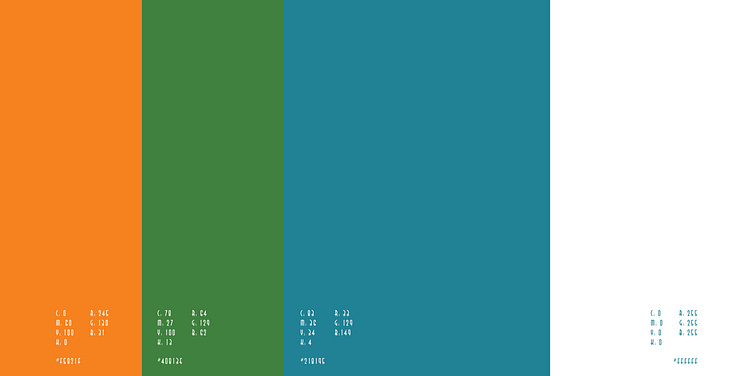
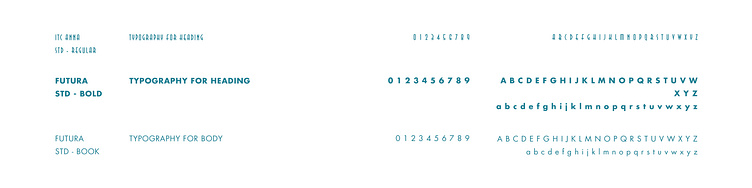
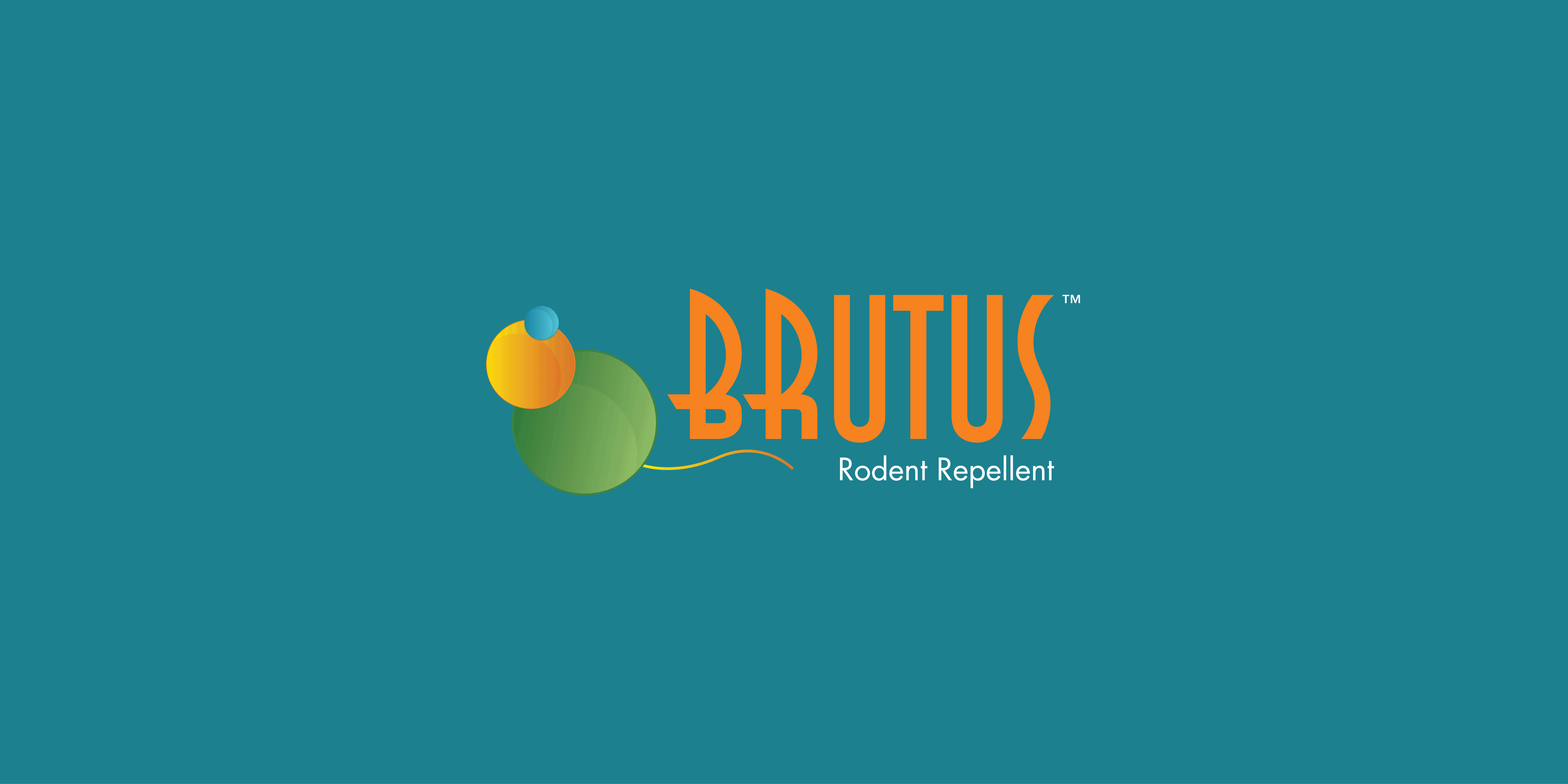
Derived from the rodent itself, BRUTUS's identity reflected its purpose as a rodent repellent, while also aligning with the visual language and color palette of MURALO Chemicals and Paints. The circular motif represented a protective bubble, symbolizing safeguarding against rodents and implying human safety. The font used for the "BRUTUS" identity was ITC Anna Std. The font used for the "BRUTUS" identity was ITC Anna Std.