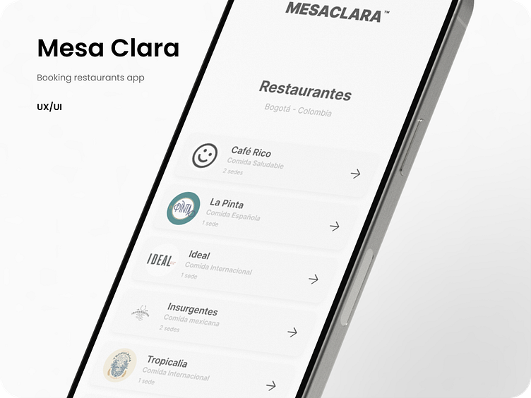
Mesa Clara - Design
What was going on?
Our client sought a sleek and minimalist approach for their restaurant reservation app design. They envisioned a clean interface that prioritizes ease of use and seamless navigation for users. Emphasizing functionality over ornate embellishments, the design focuses on essential elements, ensuring a straightforward and intuitive booking experience. By embracing simplicity, the app aims to streamline the reservation process while maintaining a modern and elegant aesthetic.
👇🏼 Scroll down
🙂 Want to say hello?
🙂 Want to say hello?
More by Simón Quintana View profile
Like


