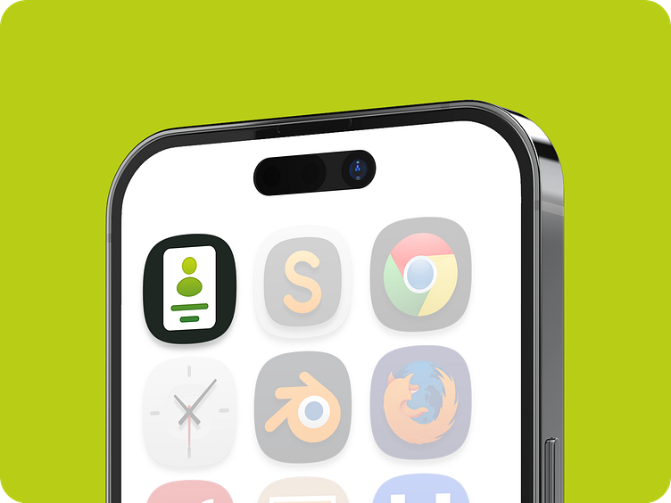
Contact App Icon Design
Concept: The icon combines elements of a phone and an address book to represent the function of the contact app.
Shape: A rounded square shape is used for the icon, providing a modern and sleek appearance while also ensuring visibility on various devices and backgrounds.
Color Scheme: A combination of blue and green is chosen for the color scheme. Blue symbolizes trust, reliability, and communication, while green represents growth, harmony, and organization. These colors evoke a sense of professionalism and reliability, important qualities for a contact management app.