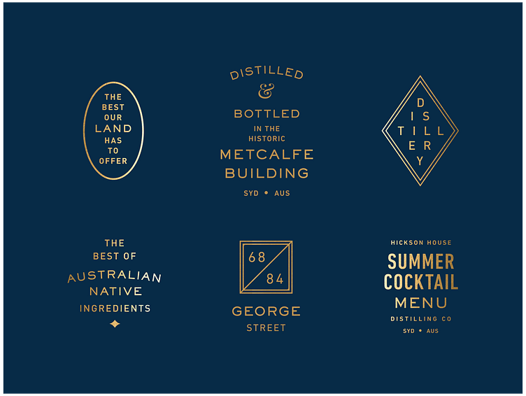
Hickson Kit of Parts
A selection of some lockups I created for various pieces of communication for Hickson House.
My love for these type lockups, kit of parts, brand systems, whatever you like to call them, started after reading an article by Bethany Heck called The Value of Multi-Typeface Design. She wrote about the breaking the two typeface rule and the possibilities that emerge when you start to break apart content that is provided via the brief, the client or the project. I didn’t know it at the time, but this school of thought became ingrained in my process and design philosophy.
Just because you are provided with a paragraph of copy, doesn’t mean you have to add clunky, long-winded lines of copy to your design. Something as simple as an address has the opportunity to be transformed into a beautiful element.
