Convertr
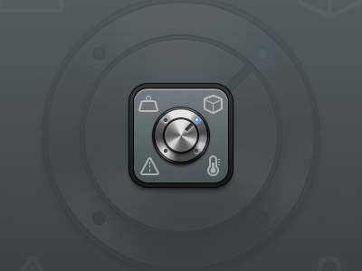
This is the final version of the iOS icon I was working on. The client was happy with the knob idea but didn't like the arrows. So I removed them and improved the LED concept. The size of the glyphs was increased as suggested for clarity. The base color was changed to match with app's UI. I believe the 512px version looks a lot better and the smaller sizes are clear enough as well (check the full view).
The icon is approved and the client is very happy with it. App itself is skilfully designed. Its 2nd version will be out soon.
Thanks everyone for the support and constructive criticism. Really appreciated.
More by Asher View profile
Like
