m-Indicator Redesign
"m-Indicator's UI needs modernization for better usability. Our redesign prioritizes intuitive navigation and visual appeal, catering to urban commuters."
Solution:
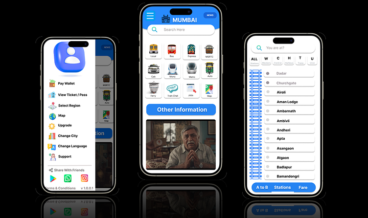
Improved User Interface: A clean, modern design focused on intuitive navigation, making it easier for users to access information quickly.
Wallet Integration: Added a wallet option for easy management of travel expenses, allowing users to store and access funds for ticket bookings.
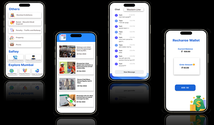
Ticket Booking: Streamlined ticket booking functionality, enabling quick and hassle-free purchases directly from the app.
Enhanced Interactivity: Interactive elements like quick access shortcuts and real-time updates to improve engagement and usability.
Commuter-Friendly Features: Information on local trains, metro, buses, and other public transport options is now presented more clearly with updated icons and layouts.
Accessibility: The design ensures ease of use for a broader range of users, including those with accessibility needs, with features like larger text and voice assistance.
