Calculator
The Challenge
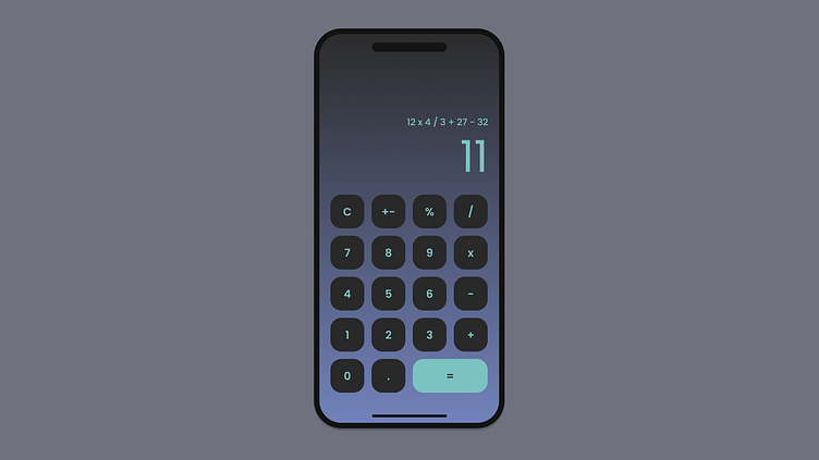
Day 004 of the 30-Day UI Challenge! The challenge was to create a Calculator. I spent 20 minutes on this.
What I Completed
Created a button component. Used an 8pt grid system with 24pt margins. I wanted to challenge myself with a dark mode theme, so I played with the color and bit until I was happy.
Reflection
This was a cool challenge to play around more with auto layout. Since I was using an 8pt grid system, I was easily able to put 16pt of space between each of the buttons. If I had more time, I would play around with visually hierarchy a bit more. The top numbers could have been lighter to show that they are not as important, but that would have involved creating a more accessible in-depth palette.
More by Logan Ahern View profile
Like


