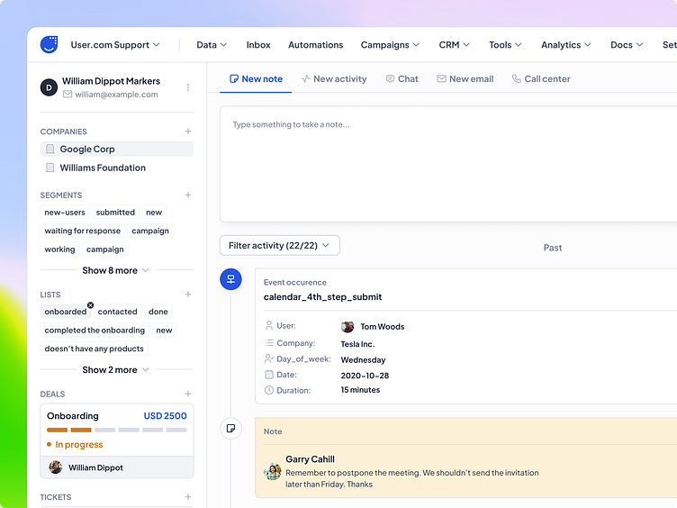
User.com - Platform Redesign
Project details
About the client
User.com is an all-in-one marketing automation platform aimed at boosting engagement and improving conversion, by using a single data source for your customers and reaching them through a wide range of communication channels: email, live chat, chatbot, push notifications, dynamic page content, and many more.
The problem
The current implementation is inconsistent and not up-to-date with the latest trends. Some modules have a different look and style, even though they use the same template. Additionally, some interactions are not intuitive.
Goals
Establish a consistent design system based on an atomic approach
Stay current with the latest UI trends
Address any accessibility issues, particularly with regards to colors
Consistency between modules that use the same templates
Improve readability
Our process
As we had worked together before, I was already familiar with the background and all tech-related details related to the app's functionalities. We began with a kick-off call to establish the approach for redesigning the entire app. We divided all app modules into separate tasks and decided to meet weekly or bi-weekly, depending on our needs.
Kick-off call
Environment setup
Moodboarding & UI direction
Module design & feedback sessions
Accessibility
Documentation & Handoff
Development phase


