DFP Logo Evolution
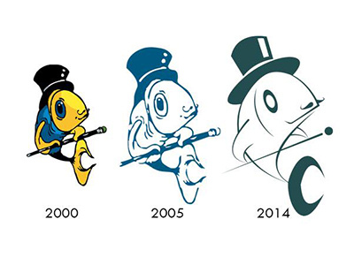
After well over 10 years of doing little to our company logo - the Dancing Fish - beyond turning him into an outline and the odd color change, we (I) decided it was well past due for some modernization.
As you can see we have gone to extremes with the new look with very clean, simple lines. But I think we've succeeded in retaining the spirit of the original. Even down to his ever-dapper 'tash.