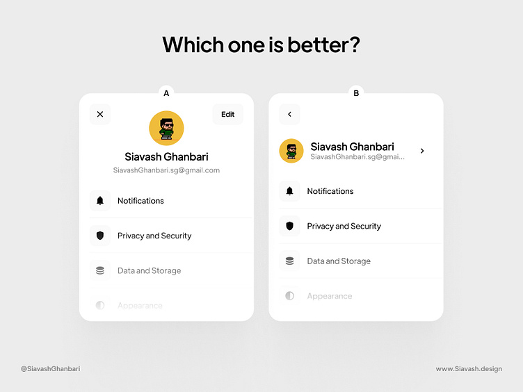
Which one is better? (Profile)
🔔 Just a gentle reminder
what I’m about to share (in this post or any other posts) is solely my viewpoint.
Your perspective matters too, and I’m always eager to learn from you!
So, get back to work!
Enter your text here...In my assessment option A stands out as the preferable choice!
Not only does it boast a visually appealing and neatly organized layout for users, but it also streamlines the process of editing user information by reducing a click.
Meanwhile, in option B, users must navigate to a separate page by clicking on their profile to access their information for editing.
What do you think?
Make sure to share your point of view in the comments section.
More by Siavash Ghanbari View profile
Like


