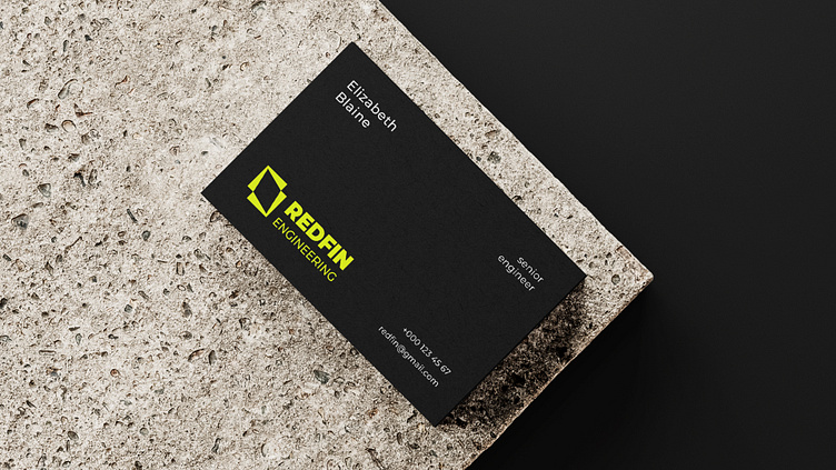
REDFIN ENGINEERING – logo and identity
Logotype | Identity
Engineering company | Redfin engineering
When Redfin Engineering approached me to design their logo, I was thrilled. They were a company owned and run by female engineers who were passionate about driving positive change through innovation. I knew I had to come up with something that reflected their commitment to excellence.
The first thing I did was research the company's values, mission, and vision. I learned that Redfin Engineering's customers were at the forefront of changing the world for the better, and that they relied on the quality of their people to achieve their ambitious goals. I also learned that the company had a culture of innovation, and they invested in their people to help them be leaders in their fields.
I thought about how windmills harness the power of the wind to create energy. I realized that a RedFin, inspired by windmills, could represent the company's commitment to innovation and engineering excellence. I presented the idea to the Redfin Engineering team, and they loved it. The logo was modern, bold, and represented the company's values perfectly. It was a symbol of the company's commitment to innovation, engineering excellence, and positive change.


