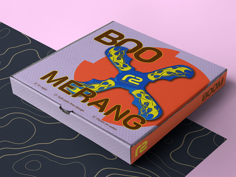
Packaging design | Amazon Listing Images | Toys
🥑 It was the design assignment to create the packaging design and product/action list images for the company providing services for Amazon sellers. At the center of this task was the boomerang, the toy for kids made from safe foam material. From that point, I started my design journey in the land of Amazon goods 🗿
📓 I want to share notes from the designer dairy about this adventure.
Day 1.
The niche was new for me and I spent more than 3 hours studying references and looking for inspiration. I hadn’t generated any concept for the design. At the end of the day I met with frustration without any ideas for the direction to move further 😞
Day 2. I started searching for the colour palette and found one suitable 🌈 It was bright with the contrast of emotional colours relevant to the kid’s products.
I don’t remember how I got to the website with the hundreds of various packaging designs. However, the main references and design style were found in this source.
Day 3.
The most exciting part of the trip has begun 🥑 My Design Approach includes creating a specific style for the product and then spreading it into other design assets. So the design of the boomerang package was the foundation of the project. I took all the artifacts and started to work.
I put the colours on the packaging mockup, selected the pair of fonts and edited in Photoshop the product image to make it comix-styled. The paper texture was added to create a feeling of something crafted.
During the work, the title font was swapped several times unless the chosen one had the same curved shapes as the boomerang.
💠 I designed a specific boomerang icon to emphasize the significant toy’s features on the package.
Day 4.
The engagement for this assignment was so high that I brainstormed ideas for the layout even during my non-design work 🤓
The ripped paper textures with purple gradients were used for the product image designs. I spent more than 2 hours cutting objects, providing colour correction and adding shadows in Photoshop. The adventure ended with the juggling of the typography and the mockup composition.
🗿 This design journey to Amazon Lands was one of the toughest in my career! To be honest, I’m not satisfied 100% with the final result, but I consider it pretty solid.
🏝️ You can join me in the design adventure for your business lands! Just contact me and I’m ready to go.
⬇️ Stay tuned and subscribe ⬇️
📧 lytvyndmytro89@gmail.com
📱 Telegram


