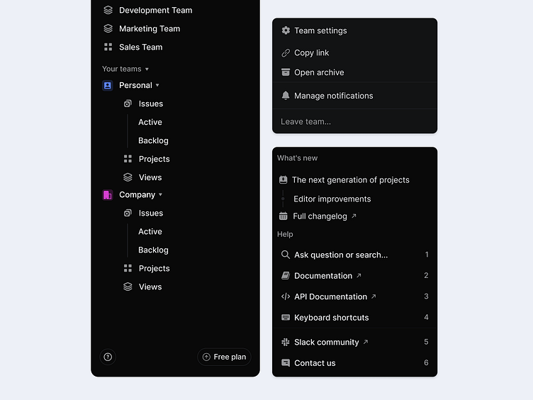
Context menu | Sidebar
Best practice:
✦ Hierarchical Organization: This hierarchy helps users easily locate and understand where to find different options, reducing cognitive load and enhancing usability.
✦ Consistent Icon Usage: This consistency in iconography enhances the user’s ability to navigate efficiently, especially useful for repetitive tasks.
✦ Prioritization of Key Actions: This prioritization minimizes navigation time, improving user flow.
✦ Keyboard Shortcuts for Accessibility: Keyboard accessibility is a great UX feature for users who prefer or require faster navigation.
✦ Expandable Sections: This keeps the interface clean and manageable, especially beneficial for users with multiple teams or projects.
✦ Contextual Options in Submenus: By only displaying relevant actions, this feature reduces the likelihood of errors and helps users find what they need faster.
Have a complex web application idea?
Let's make it together!
Say hello at 💌
ux.sergushkin@gmail.com
Visit my Website 🌎
dmitrysergushkin.com
For more inspiration, visit my profiles ✨
Are you looking for a design partner?
📮 Email to ux.sergushkin@gmail.com
👨💻 Check me out at dmitrysergushkin.com
↳About me
My name is Dmitry, and I am a digital product designer. I specialise in investigating and improving user experiences for CRM systems, SaaS platforms, Back offices, and web applications. I develop innovative solutions by identifying the problem that needs addressing and creating a meaningful experience that meets the needs of end-users, aligning it with the context in which the product will be used.
↳Services I provide
User Experience (UX) Design • User Interface (UI) • DesignWeb & SaaS Application Design • MVP Design & Development • Product Redesign & Optimization • Wireframing & Prototyping • UX Strategy & Discovery • Design Systems & Documentation
