ECUADOR | place branding | icons
ECUADOR
place branding
Icons
Embodying the Complexity of a Nation
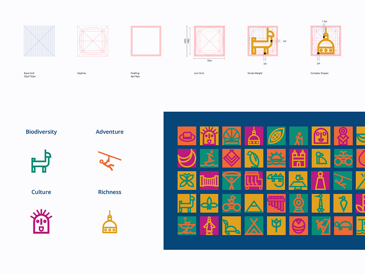
The concept of encapsulating an entire country within a brand led to the idea of dividing Ecuador into four distinct areas, each associated with a unique color. This approach allows the brand identity to evolve alongside the country, enabling the easy addition of elements while maintaining its core identity.
Creating Personalized Experiences
The implementation of icons was carefully considered to provide visitors with the opportunity to craft their own experiences by combining the four areas during their visit to Ecuador. This approach ensures a comprehensive and fulfilling experience in every part of the country.
Inspired by Pre-Columbian Cultures
Ancient pre-Columbian cultures were characterized by visual designs dominated by basic shapes that expressed harmony and perfection, such as triangles, circles, and squares. Drawing inspiration from this heritage, the icon system is based on geometric shapes from which the various elements are derived.
______
Explore the full project on Behance
