Banking Website Design Concept
💌 Have a website idea? Let's bring it to life together!
hello@ronasit.com | Telegram | WhatsApp | Website
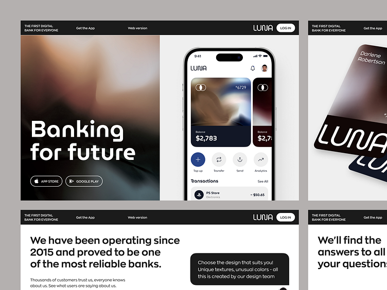
Hello everyone! Our team has created a design concept for a landing page promoting a banking application. Let's dive into the details.
The landing page features a section showcasing the mobile app, a block displaying testimonials, information about the services offered, and a section with answers to frequently asked questions.
We opted for a limited white-gray color palette, indicating the seriousness of the service being promoted.
The main characteristic of this design is the use of decorative background gradient textures on the website, resembling the design elements commonly found on bank cards. This design choice adds a touch of sophistication and elegance, enhancing the overall visual appeal of the landing page.


