Payment Page
The Challenge
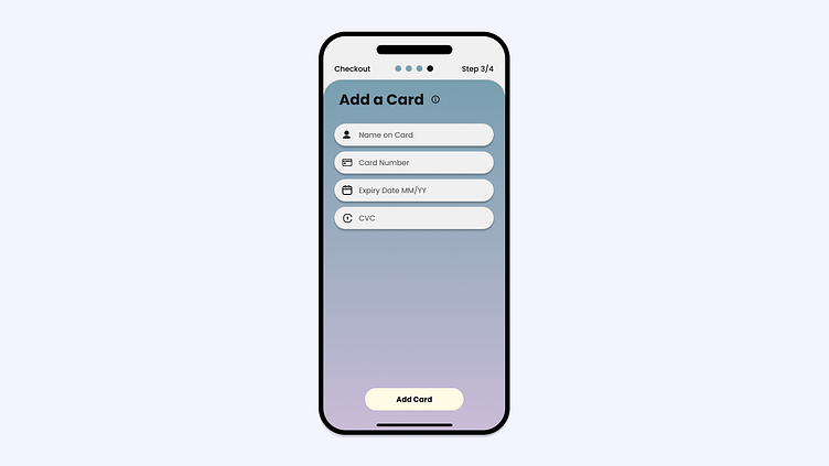
Day #002 of the 30 Day UI Challenge. The challenge was to create a Credit Card Checkout. Completed in 45 minutes.
What I Completed
This was a fun project! As I was laying out this page, I realized I would not be able to include the object someone was purchasing, the payment method, adding the payment method and confirming the purchase, all in one screen. So I broke it up into 4 steps, and in this case, show the user on step 3 adding in their credit card information. Once they add their card info, they hit "Add Card" at the bottom and would be directed to step 4/4, which would confirm their purchase!
Reflection
I was running out of time and so I did not get a chance to check the colors for accessibility. Going forward, I think I will try to find a few color palettes while moodboarding so at the end I don't spend so much time trying to find a color. Also, I'm not sure if the gradient here works well. I definitely want to play with it further.


