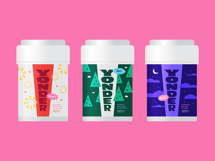
Yonder, Alternate Packaging
Unused packaging concept for Yonder.
This concept revolved around a central Yonder wordmark featured in an upward and outward direction to symbolize the exploration that lies ahead – either internally or externally.
Each individual product features a simple scene or illustration to bring in some playful dimension. The illustration style is low-fidelity and blocky similar to the ‘hand-made’ nature of the logo.
–
Get in touch if you're looking for a creative partner!
More by Cameron Maher View profile
Like
