Brand Identity Design for Britta Bibel
At the core of Britta Bibel's brand identity lies a journey of transformation and empowerment, reflecting her role as a corporate coach dedicated to fostering holistic high-performance. Our approach to crafting her brand identity was meticulous, reflecting her essence and values with precision and creativity.
Evolution of the Logo: We embarked on this journey by meticulously forming the letter 'B' from an intricate arrangement of geometrical blocks, a bespoke creation tailored to meet the client's exacting standards. Through a process of exploration and refinement, we experimented with various iterations, from color-blocking to adjustments in dimensions, size, and weight.
Version 1.1
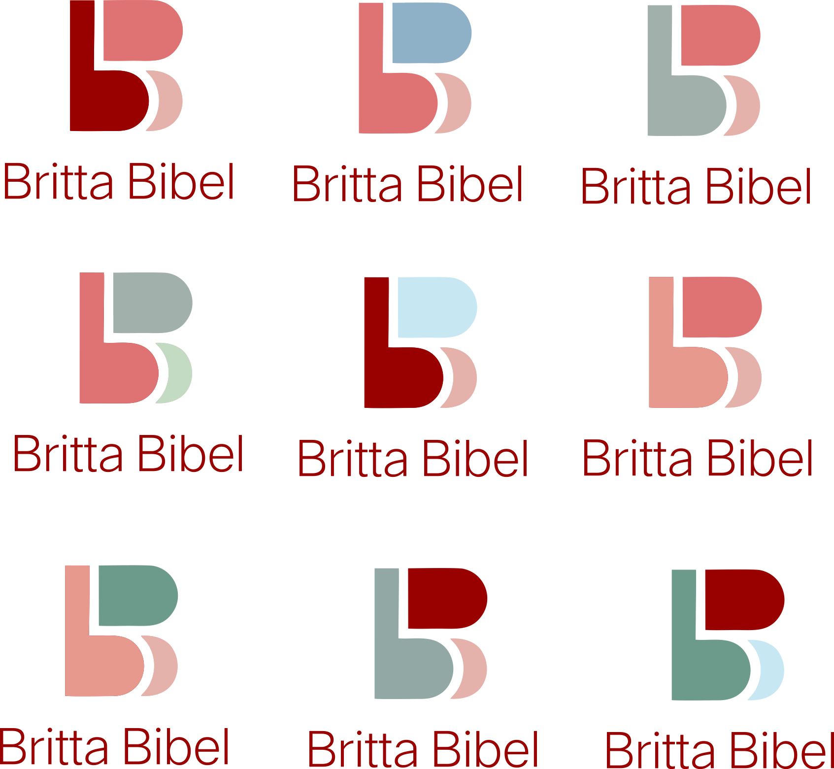
Version 1.2 - Color Variations
Version 1.3
Version 1.4 - Proposed By Client
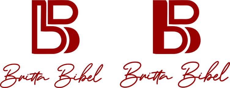
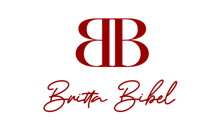
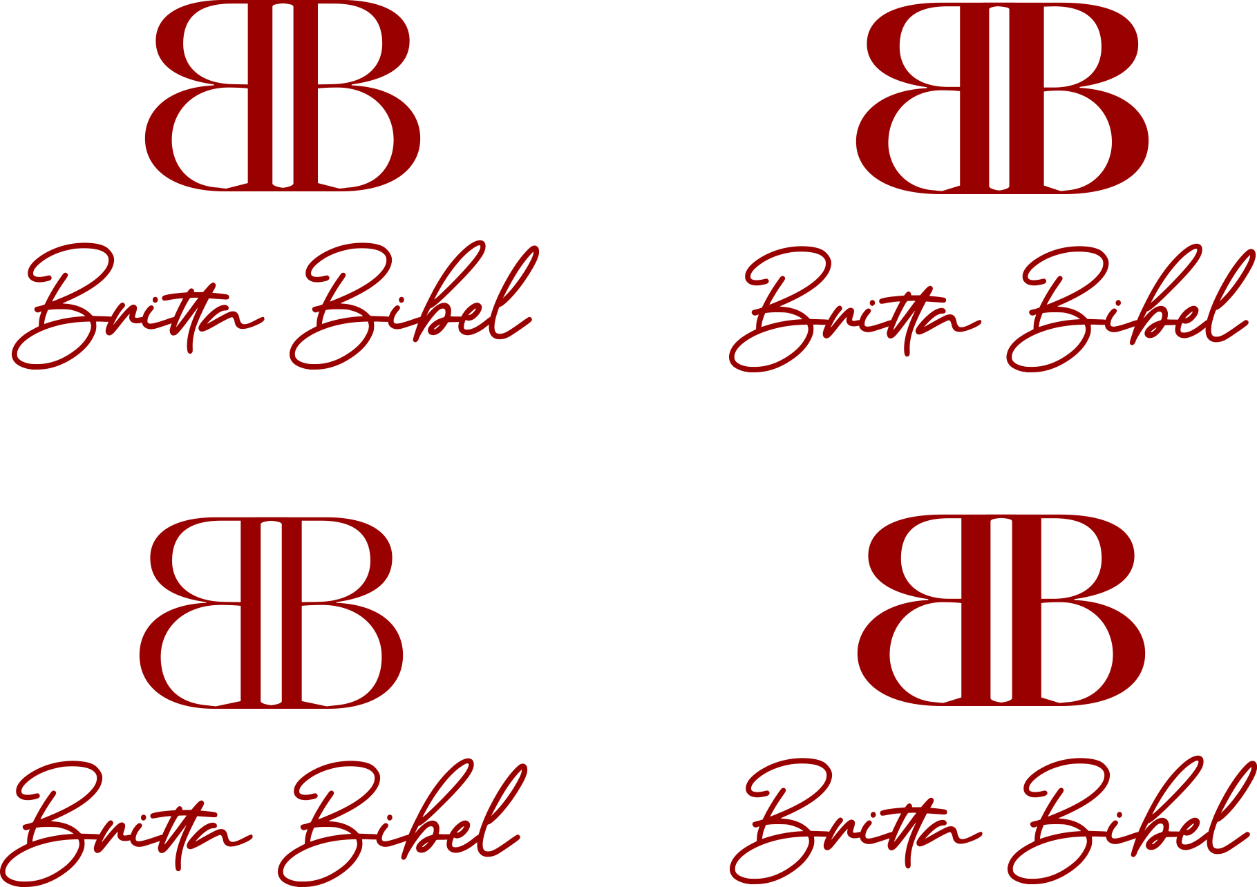
Symbolism in Design: As the design journey progressed, we introduced a compelling concept: a logo where the letters 'BB' of Britta Bibel are reflected horizontally while seamlessly merging into a singular, harmonious entity. This artistic representation symbolizes Britta's holistic approach to coaching, where individual elements unite to form a greater whole, reflecting her values of collaboration and synergy.
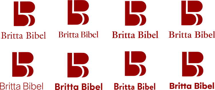
Various versions of the mirror effect design were presented by utilizing different fonts & styles to create diverse visual impressions. Each font selection & variation conveys a unique tone or personality, offering flexibility in branding and design representation.
Version 2.1
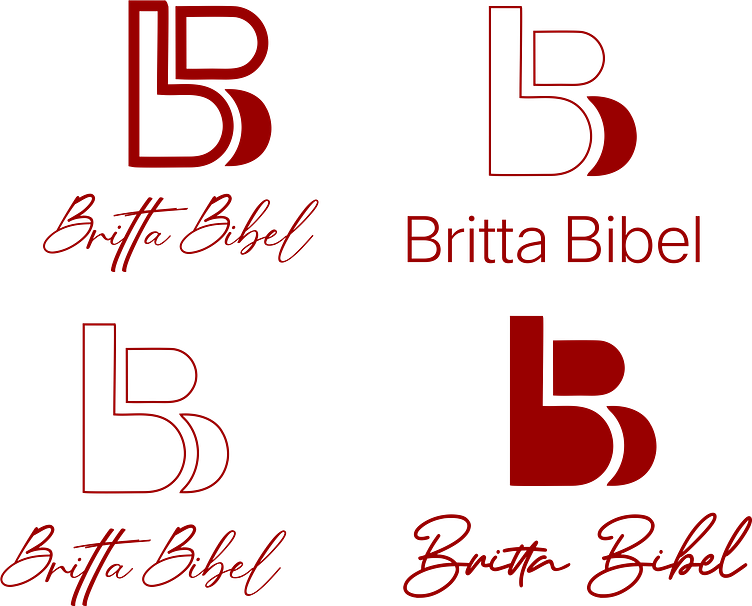
Signature Touch: To add a personal touch to the brand identity, we crafted a signature version of the logo, featuring Britta's name in an elegant italic handwriting font. This versatile iteration can be used independently or in conjunction with the graphical element, offering flexibility and a touch of sophistication to her brand representation. A diverse range of fonts and typography were used for consideration.
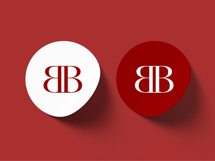
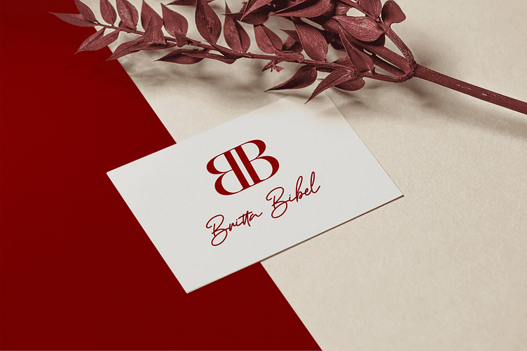
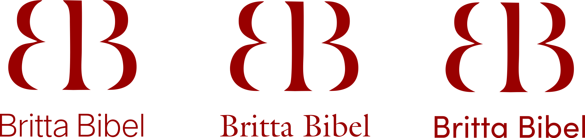
Color Palette: In the pursuit of visual cohesion and impact, we opted for a single solid Dark Maroon color palette for the full logo, encompassing both text and graphical elements. This bold yet sophisticated hue exudes confidence and professionalism, serving as a visual anchor for Britta Bibel's brand identity across various platforms and mediums.
Version 2.2
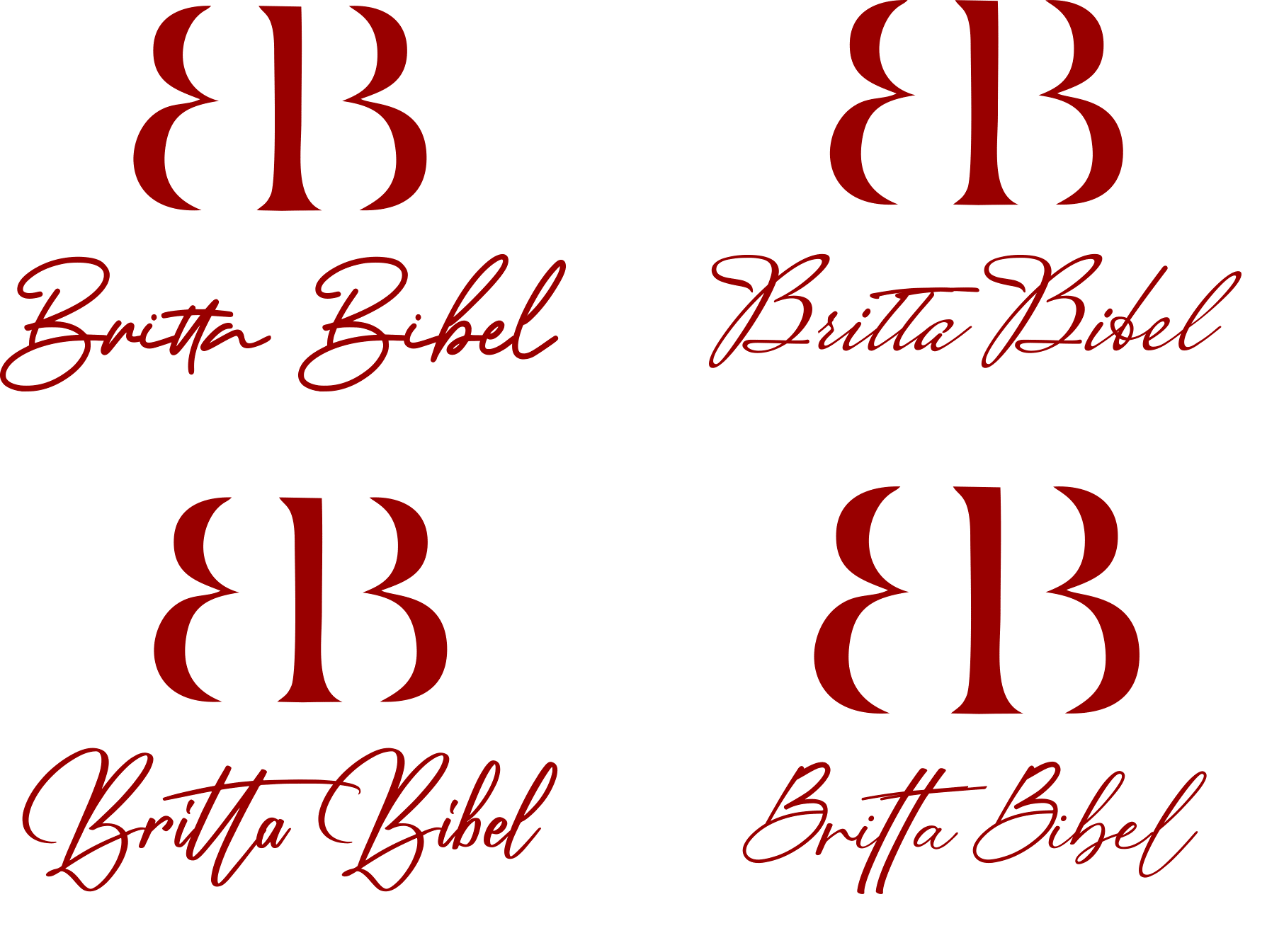
V 2.3 - Shape & Border Variations
V 2.4 - Line Width Variations
Through a thoughtful blend of creativity, symbolism, and attention to detail, we crafted a brand identity that truly embodies the essence of Britta Bibel's transformative work. From the evolution of the logo to the choice of colors and typography, every element is a testament to her commitment to excellence and empowerment. This enhanced brand identity not only captures Britta's unique essence but also serves as a powerful tool to inspire and engage her audience on their journey towards holistic high-performance.
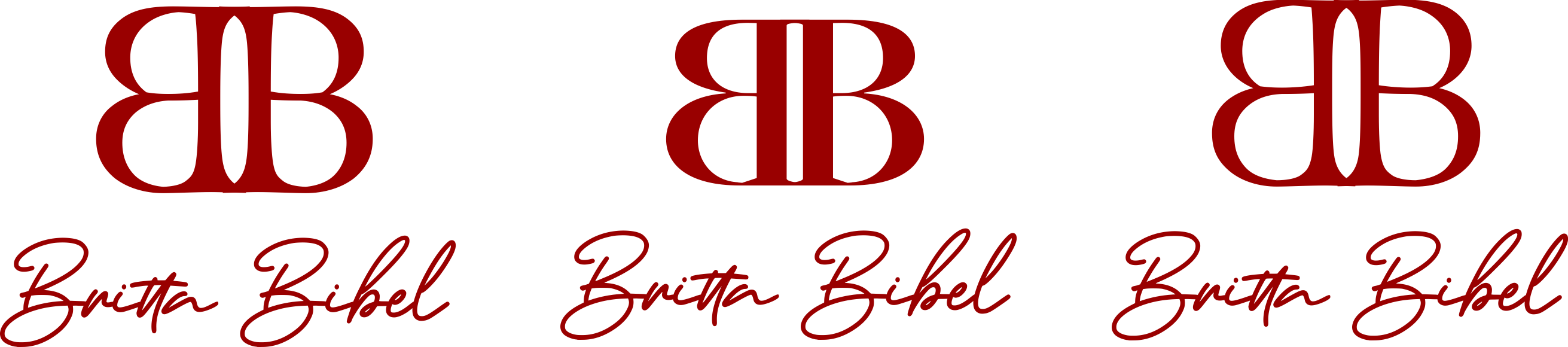
Final Graphic Version

Final Signature Version

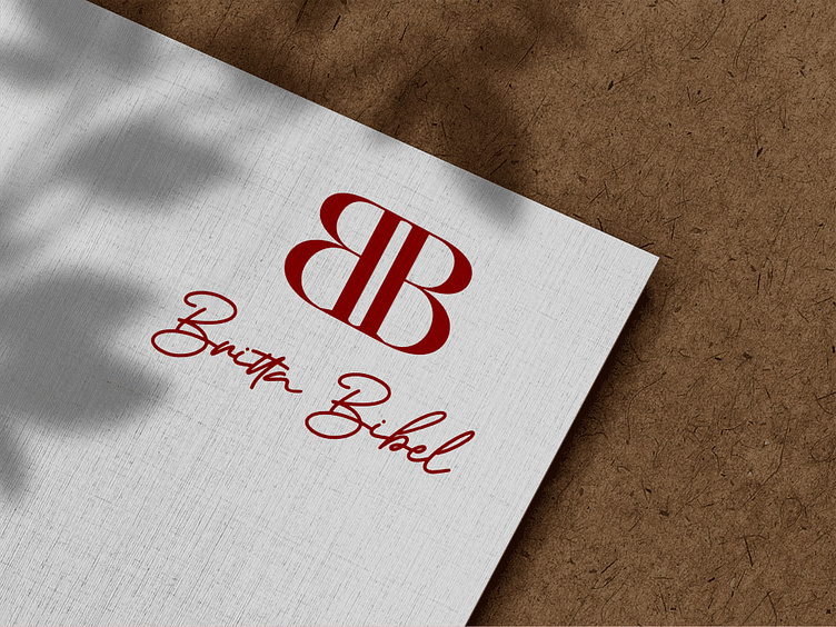
Final Full Version