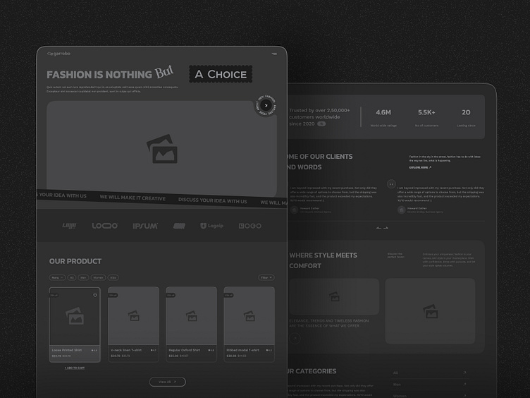
Wireframe - Ecommerce Website (UX/UI Study)
The "wireframe design" section of an E-commerce Fashion website serves as the blueprint for the site's layout and functionality. It outlines the skeletal framework, detailing the placement of essential elements such as navigation bars, product grids, and checkout buttons. This stage is pivotal in mapping out the user journey, ensuring seamless navigation and intuitive interactions. By focusing on simplicity and clarity, the wireframe design lays the groundwork for a visually stunning and user-friendly online shopping experience tailored to the fashion industry's unique demands.
In website design, the choice of color theme and typography profoundly influences the overall aesthetic and user experience. The color theme sets the tone and mood of the website, evoking emotions and creating visual cohesion across different pages. It should complement the brand identity while ensuring readability and accessibility. Similarly, typography plays a crucial role in conveying the brand's personality and guiding users through content. The right combination of fonts enhances readability and hierarchy, facilitating seamless navigation and engagement. Together, the color theme and typography work in harmony to establish a strong visual identity and convey the brand's message effectively.
______
Do you have any opinions or suggestions? Kindly leave a remark.
I sincerely hope you enjoy it, and if you do, hit "L" ❤️.
Do you want to work with us? 🤝
📧Talk with us at : uiux.parth@gmail.com


