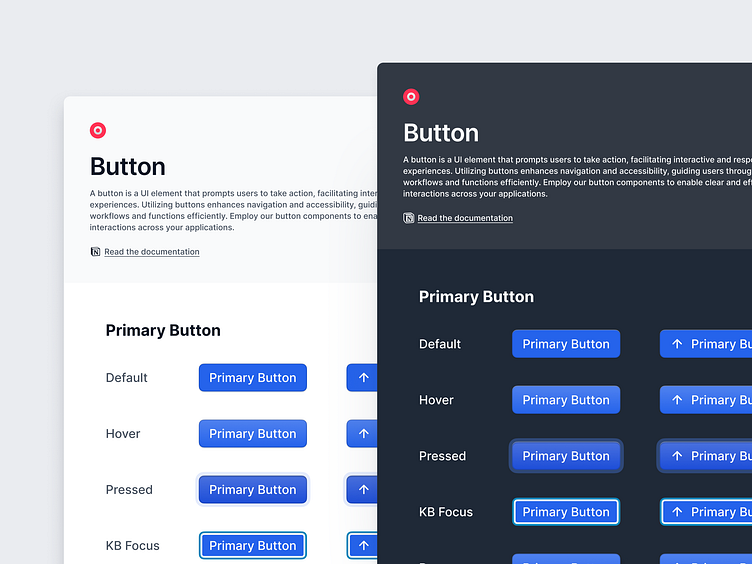
Stello Design System - Button Component
Stello is a design system created by me, to help build consistent interfaces that are user-friendly. It bundles design tokens, design patterns, front-end code, and guidelines as a foundation that is not overly complicated. Origin provides just the right building blocks to quickly craft a better user experience in SaaS products.
Button Component
A button is a UI element that prompts users to take action, facilitating interactive and responsive experiences. Utilizing buttons enhances navigation and accessibility, guiding users through desired workflows and functions efficiently. Employ our button components to enable clear and effective user interactions across your applications.
The primary button is used for the main action on a page. It stands out with a bold design to capture user attention and encourage interaction. Use it for the most important actions that drive the primary objectives.
Secondary buttons support the primary action and are used for less critical tasks. They have a more subdued design, ensuring they don't compete with the primary button while still providing clear functionality.
Tertiary buttons are for additional, less prominent actions. With a minimalist design, they offer a low-emphasis option for actions that are still necessary but not as crucial as those handled by primary or secondary buttons.
Destructive buttons are used for actions that delete or remove content. They are typically styled in a way that signals caution, such as using red or other attention-grabbing colors, to warn users about the potential consequences of the action.
I’m currently available for freelance projects or full-time opportunities. Let’s bring your ideas to life! Feel free to contact me here on Dribbble or via email: hello@thimira.me


